VoiceOver navigation support in your apps comes with the same requirements as navigating through touch controls. When navigating apps with standard touch controls, we tend to dislike apps that feel cluttered or make us do many interactions to achieve something. We’d probably say such an app does not offer a good user experience. The same principles apply when using VoiceOver (and other assistive technologies). You want to achieve your goal with a minimum number of interactions, and you want the app to give you the necessary context concisely and cleanly as you need it.
I’ve invited over Dani for this guest article to bring you to improve your accessibility-related knowledge. Follow his #365DaysIOSAccessibility hashtag on Twitter to gain even more updates.

This article will explore some of the VoiceOver improvements we’ve implemented into Stock Analyzer App (built-in SwitfUI). We’ve improved VoiceOver navigation by grouping elements, improving accessibility labels, using good headers, and removing clutter and superfluous elements.
Navigation through headings with VoiceOver
Let’s start with headings. Headers are handy for visually dividing and organizing information. Headers help users browse more effectively what a screen offers, quickly identifying interesting parts and focusing on them. That’s also the case for VoiceOver users using a so-called rotor. The rotor is a menu you can show by rotating two fingers around a center point on the screen when VoiceOver is on. It gives you navigation options and customizations, one of which is navigating through headings by swiping up (to go to the previous header) and down to jump straight to the next one.
If you’re new to testing accessibility, I encourage you to read my article Tips for testing your iOS app’s accessibility.
In code, it takes a single line to mark an element as a header. It’s as easy as adding the .isHeader trait to anything representing a header on the screen. It’s one of my favorite quick wins to improve navigation with VoiceOver and a great starting point for you. It gives the user context on what they can find on the screen and a quick way back to the top with a simple swipe-up gesture.
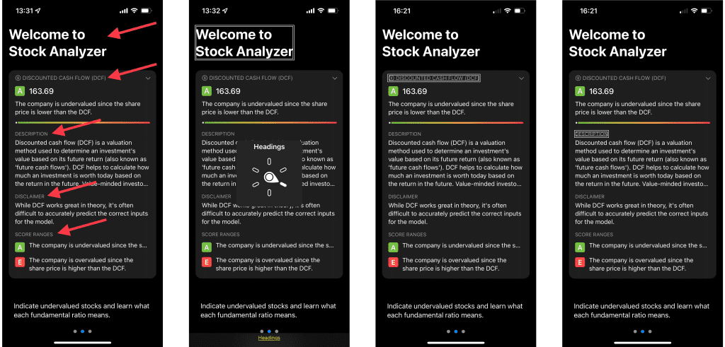
The first screenshot of the app shows you red arrows pointing to good candidates to get the .isHeader accessibility trait added. The second screenshot shows you The Rotor menu with the Headings option selected. With this configuration, a swipe down would bring the users from what is focused in the third screenshot, the “Discount cash flow (DFC)” header, towards what is focused in the fourth screenshot: the “Description” header.
The code to assign the header accessibility trait looks as follows:
Text("Welcome to Stock Analyzer")
    .font(.largeTitle)
    .bold()
    .padding()
    .accessibilityAddTraits(.isHeader)
The key modifier for you to apply is the last accessibilityAddTraits modifier.
Grouping elements
Grouping elements in logical pieces of information is crucial to offer a good VoiceOver experience. The grouped elements will improve other assistive technologies such as Switch Control or Full Keyboard Access.
For context, when using VoiceOver, users tend to navigate in two main ways. The first is by exploring what’s on-screen by moving your finger around. VoiceOver will continuously announce what the user is touching. The second is by swiping to the right to move VoiceOver’s focus to the next accessible element and left to move it back. Because touching (or tapping) an element on the screen selects it and announces it, you’ll have to perform a double tap (anywhere on the screen) to interact with it. Grouping elements will improve both strategies’ navigation, especially with the second one. The UI of your app converts from a two-dimensional interface to a one-dimensional where the user navigates sequentially through elements.
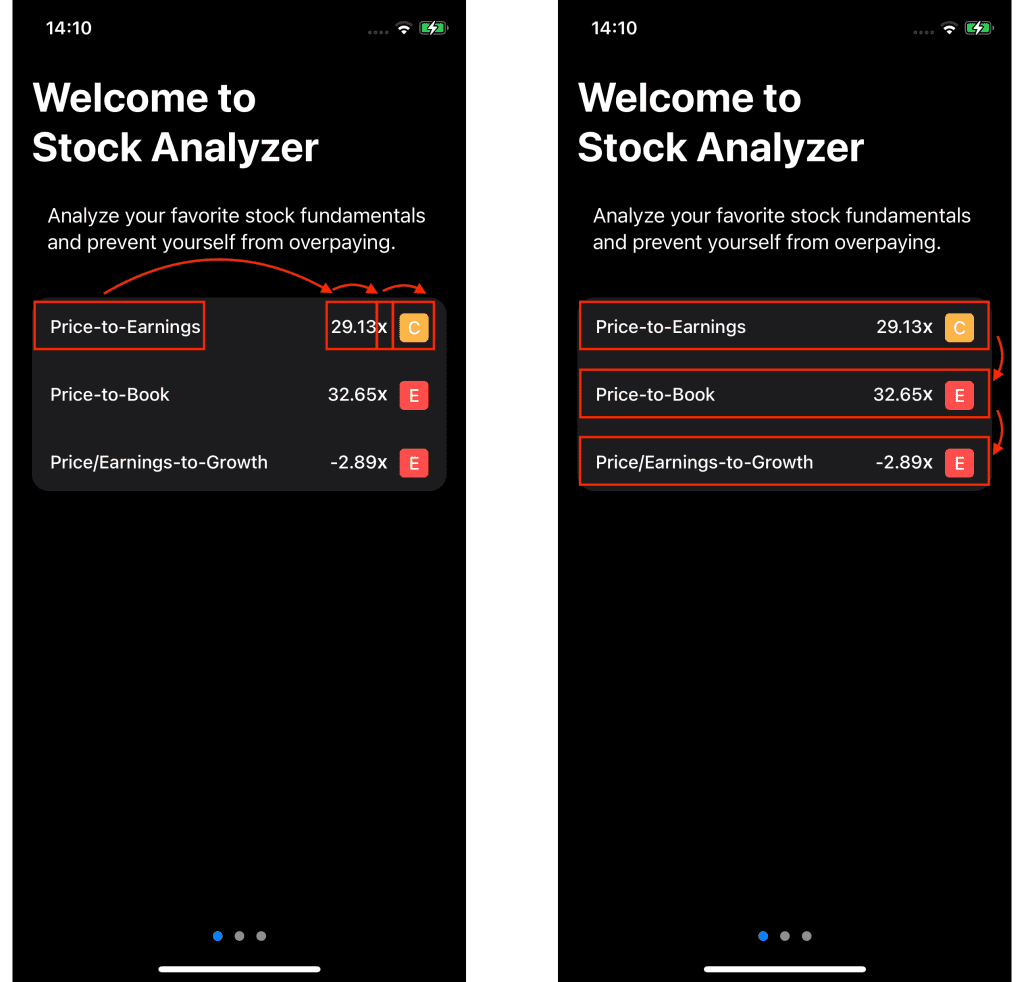
Take StockAnalyzer’s onboarding screen as an example. By default, each one of the four elements in each row is a separate accessibility element. That means going from the information in the first row to the second one, the user needs to swipe four times. Twelve swipes to go through the whole table. We can improve by grouping elements in each row, so the user needs just one swipe to move between rows and just three swipes to go through the whole thing. And as you’ll discover, it will also make it much easier to understand what’s on screen.
UIKit vs. SwiftUI Element Grouping
SwiftUI makes grouping elements extremely easy. With UIKit, I usually made the containing view an accessibility element and combined the accessibility labels of the subviews myself. I’ve had to add them to an array of optional strings, remove nil and empty strings, and join them with a separator. SwiftUI, on the other hand, does this automatically using the .accessibilityElement(children: ) modifier, with the .combine parameter. That will pretty much do what my UIKit code does, but with one significant advantage (apart from being way less code): if later on, you modify the UI, you don’t need to remember to add the new element to an array manually, it will just work.
HStack {
    //… child elements
}
.accessibilityElement(children: .combine)
Clearer accessibility labels
By doing this, we achieved our goal of grouping all these elements. The accessibility label for the group will be “price to earnings, 29 dot 13, x, Cap C”. To follow up, we can do another improvement, so the accessibility label makes a bit more sense to the user. We’ll make it sound more natural by combining the number and the “X”, despite them being two different Text views. The “X” can be read as “times”; and “Cap C”, would be better understood as “C rating”. We can achieve the first bit by grouping the HStack containing both the input value Text and the “X” text. This time, we’ll build the accessibility label ourselves to avoid them being separated by a comma, which adds a pause when they get announced by VoiceOver.
HStack(spacing: 0) {
    Text(inputValue as NSNumber, formatter: formatter)
    if criteria.valueProvider.isRatio {
        Text("x")
            .font(.callout)
            .bold()
            .padding(.bottom, 1)
    }
}.accessibilityElement()
    .accessibilityLabel(Text("\(inputValue as NSNumber, formatter: formatter) times"))
The accessibilityElement() modifier takes .ignore as the default children parameter, of type AccessibilityChildBehavour. So it is effectively the same as doing accessibilityElement(children: .ignore). As the name suggests, this will ignore its child views, so we need to use the accessibilityLabel() modifier for the stack to have an accessibility label at all. In this case, we format the number accordingly and use string interpolation to add the word “times” instead of “X” at the end.
Lastly, “Cap C” doesn’t mean much. We will change the RatingView component, so its accessibility label says something like “C rating” instead. With these couple of changes, the accessibility label for the row will now announce “price to earnings, 29 dot 13 times, C rating”. Much better!
Hiding unnecessary elements for VoiceOver control
The last technique we will see in the article is the possibility of hiding elements on the screen that don’t convey helpful information. It tends to happen mainly with purely decorative images enriching your app visually without adding value to the experience. In those cases, making these images accessible adds clutter and increases your users’ cognitive load when navigating your app.
SwiftUI offers an accessibility modifier for these cases that lets you hide any unnecessary elements:
Image(systemName: "chevron.right")
.accessibilityHidden(true)Conclusion
We’ve seen four little areas of improvement to enhance how your users navigate your app using assistive technologies. You can configure headers with the .isHeading accessibility trait and group elements that align logical pieces of information. Pay attention to the resulting accessibility labels, and hide unnecessary elements for accessibility purposes. You may have noticed that for each one of these approaches, one (or at most two) lines of code is all we need. These are tiny effortless changes with a substantial positive impact on your users! Because of the easiness of building reusable components in SwiftUI, these improvements will cascade through the app wherever you reuse them. Improving VoiceOver’s experience in the app will cascade into improvements for Switch Control and Full Keyboard Access, for example. What’s not to love about making apps more accessible?
If you want to improve your accessibility knowledge, even more, check out the #365DaysIOSAccessibility hashtag. Feel free to contact Dani or tweet him, on Twitter if you have any additional tips or feedback.
Thanks!