Apple introduced SF Symbols during WWDC 2019 as a big present for developers, as they’re straightforward and free to use. Apple introduced several updates over the years, resulting in a library of over 6000+ symbols.
All symbols are designed to integrate seamlessly with San Francisco, the system font for Apple platforms. If you remember the days of finding icons yourself via Google, you’ll know it’s a big advantage to have high-quality icons ready for you to use.

What are SF Symbols?
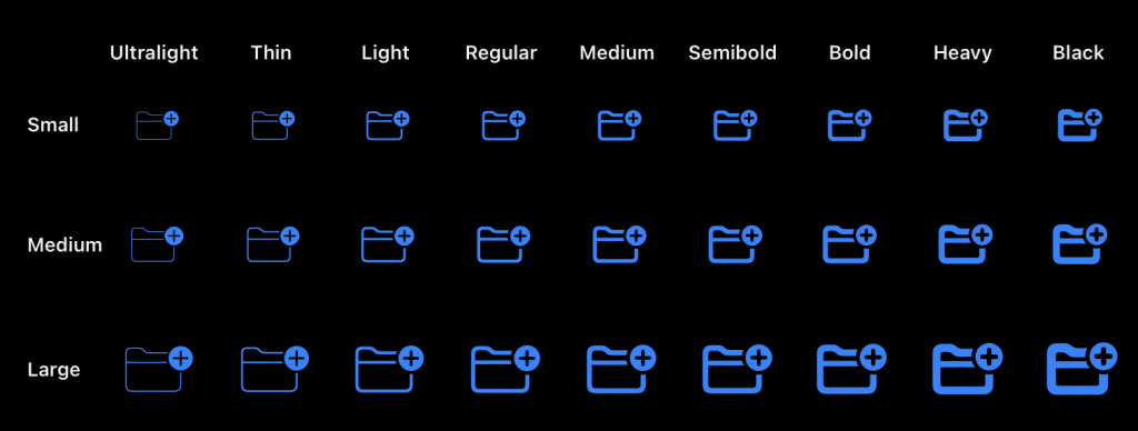
Apple designed SF Symbols as a library of 6000+ icons that you can use for free as a developer. They integrate seamlessly with Apple’s system font San Francisco and come in nine weights and three scales. SF Symbols automatically align with text, and you can export them as vectors to create custom symbols with similar design characteristics and accessibility features.
How to list all available icons using the SF Symbol app?
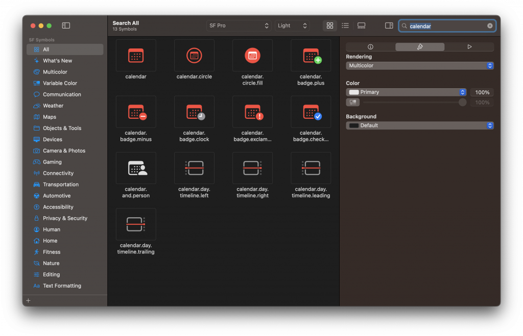
Before exploring the specific features of SF Symbols, it’s essential to know where to find the 6000+ available symbols.
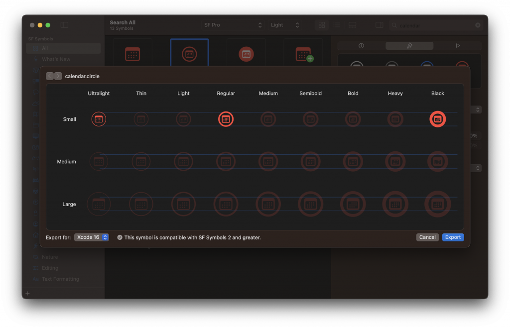
You can download Apple’s official SF Symbol app for macOS via their website. The app allows you to list all available symbols via an overall symbols overview, a category browser, or by using a search. You can adjust the font settings, rendering mode, and color to simplify picking the best icon for your use case. Here’s an example where I’ve searched for a calendar icon in light font-weight and multicolor rendering enabled:
How to use SF Symbols in SwiftUI
After finding the proper icon inside the Mac app, you can right-click the icon and select “Copy Name”. You can use the name in SwiftUI as follows:
Image(systemName: "square.and.pencil")Or combine an image with a label:
Label("Heart", systemImage: "heart")You can even combine multiline strings with symbols:
Text("""
    This SwiftLee example is combined with
    a symbol \(Image(systemName: "chevron"))
""")
As you can see, Apple made it straightforward to use the SF symbols in SwiftUI:
- Browse and find your icon in the SF Symbols Mac app
- Use
⇧⌘Cto copy the name of the symbol - Use the name inside the
Image(systemName:)initializer - Use the image inside a Label, Button, or any other view
How to change the scale of a symbol in SwiftUI?
Each icon comes in different scales, which you can configure as follows:
Image(systemName: "square.and.pencil")
    .imageScale(.large)
How to change the SF Symbol Weight in SwiftUI?
A symbol in SwiftUI responds to the regular font and color settings. Therefore, you can adjust the weight and color as follows:
Image(systemName: "heart")
    .foregroundStyle(.red)
    .bold()
Configuring Symbol variants
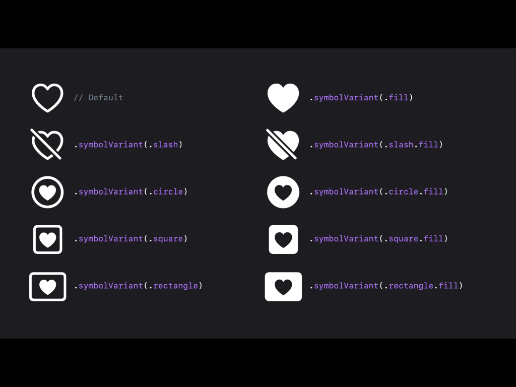
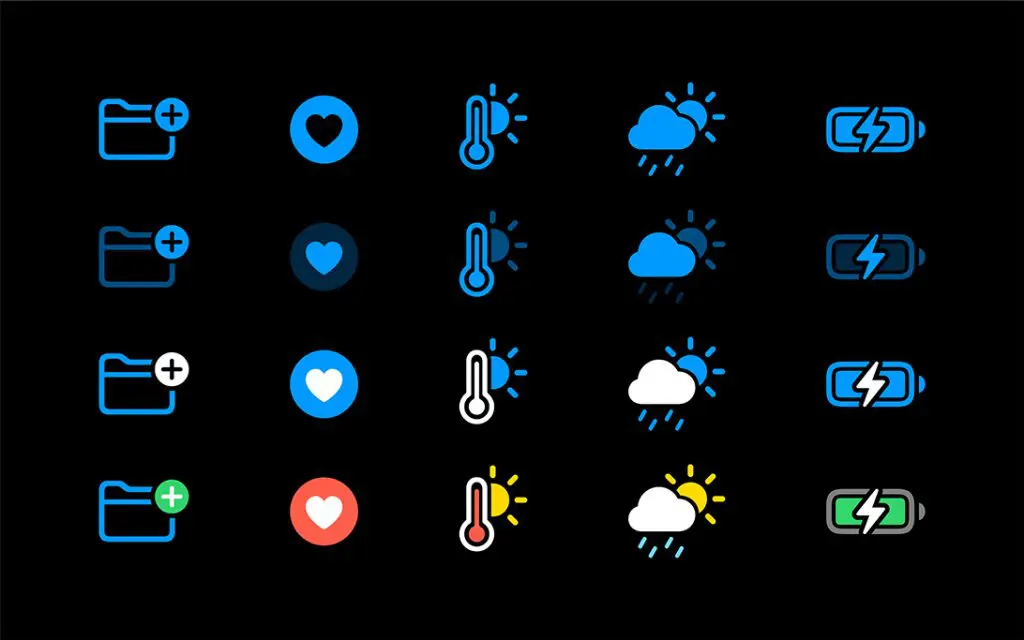
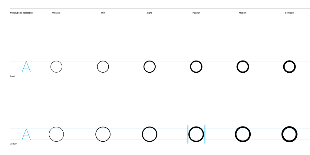
The image above shows that you can configure symbols in many different variants. You can use the following code to do so in SwiftUI:
Image(systemName: "square.and.pencil")
    .symbolVariant(.rectangle)
As you can see, you no longer have to define .fill inside the symbol name. This is a new feature starting from iOS 15 that allows the system to adjust icons accordingly based on where they are used. For example, the outline variant can be used in tab bars on iOS, while the filled variant will be used within tabs on macOS. This is a great addition that eliminates the need to think about using the right variant in the right elements.
Adjusting the rendering mode and colors
We’ll discuss available color customizations and rendering modes in a bit, but here’s the code to get you started:
Image(systemName: "thermometer.sun.fill")
    .symbolVariant(.circle.fill)
    .symbolRenderingMode(.palette)
    .foregroundStyle(.red, .yellow)
The code applies a filled circle variant and palette rendering mode, using red and yellow colors.
SF Symbol Animations
A symbol comes in different variants and consists of several layers. You can animate each of those layers, resulting in a more appealing user behavior.
Animating a symbol change
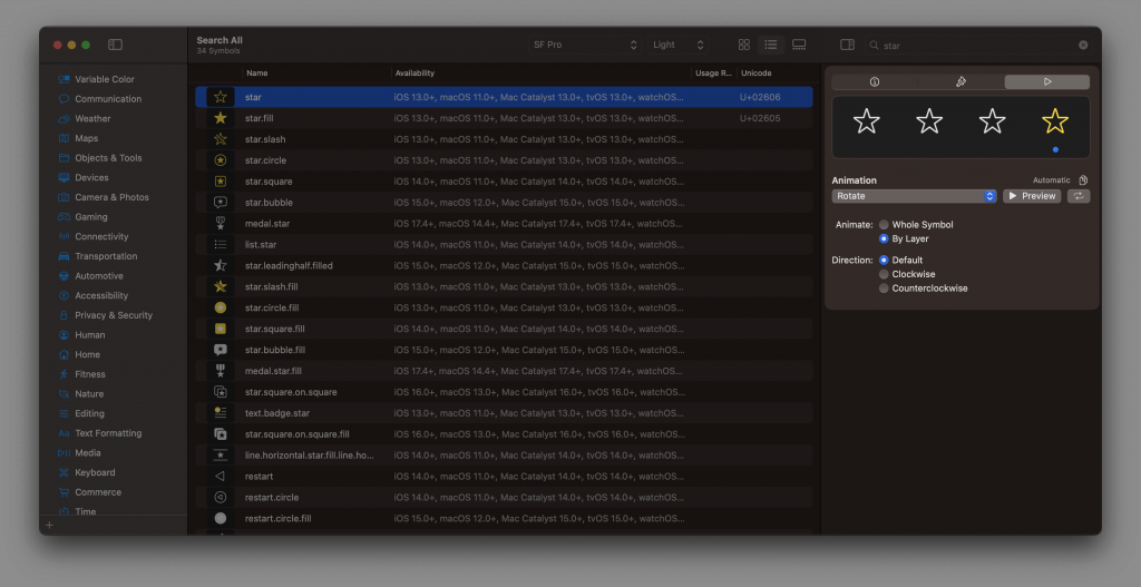
Many of the SF Symbols support animations, as you can explore inside the Mac application:
You can apply the animations that are available in SwiftUI using the content transition modifier. For example, you can animate a star symbol when the user favorites an item:
struct SymbolAnimation: View {
    @State var isFavorite = false

    var body: some View {
        Button {
            withAnimation {
                isFavorite.toggle()
            }
        } label: {
            Label("Favorite", systemImage: isFavorite ? "star.fill": "star")
        }
        .contentTransition(.symbolEffect(.automatic))
    }
}
In the above example, we’re using the automatic symbol effect. This applies the default animation to a symbol-based image in a context-sensitive manner. The symbol will be animated from an unfilled to a filled star whenever you press the button.
Repeating an SF Symbol animation
You can also enable a repeating animation based on a value change. For example, you could animate the Wi-Fi icon as if it’s searching for a new connection:
struct WiFiButton: View {
    @State var isSearchingForWiFi = false
    @State var runSearchForWifiAnimation = false

    var body: some View {
        Button {
            isSearchingForWiFi.toggle()
        } label: {
            Label(title: {
                Text("Search for WiFi")
            }) {
                Image(systemName: "wifi")
                    .symbolEffectsRemoved(!isSearchingForWiFi)
                    .symbolEffect(.variableColor, options: .repeat(.periodic), value: runSearchForWifiAnimation)
                    .onChange(of: isSearchingForWiFi) { _, newValue in
                        if newValue {
                            runSearchForWifiAnimation.toggle()
                        }
                    }
            }
        }
    }
}
Note that we’re detaching the isSearchingForWiFi from the symbol effect, as we need to handle the animation state separately. Otherwise, SwiftUI won’t redraw the view to reset the animation, and it will loop forever. We only remove the effect when we’re changing isSearchingForWiFi to false using the symbolEffectsRemoved modifier.
A few other things are essential to mention:
- We use the
variableColorsymbol effect to apply the animation to each individual layer - The
repeatingoption enables an endlessly repeating animation - Only if
isSearchingForWiFichanges to true, we’re starting the animation.
Changing the speed of a symbol animation
Imagine the previous Wi-Fi icon animation as one that only runs five times:
Image(systemName: "wifi")
    .symbolEffect(.variableColor,
        options: .repeat(5),
        value: runSearchForWifiAnimation
    )
We can adjust the speed of this repeating animation by adding the speed multiplier option to run the animation twice as fast:
Image(systemName: "wifi")
    .symbolEffect(.variableColor,
        options: .repeat(5).speed(2.0),
        value: runSearchForWifiAnimation
    )
Enhanced color customization and rendering modes
You can configure SF Symbols with different rendering modes, providing greater control over how color is applied to symbols.
There are three different rendering modes:
- Hierarchical rendering to add depth and emphasis using a single tint color with multiple levels of opacity
- Palette rendering using multiple contrasting colors
- Multicolor rendering provides intrinsic colors across hundreds of symbols
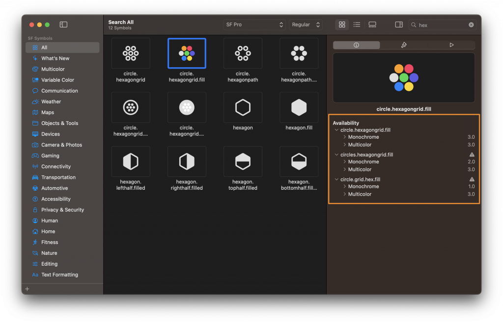
Not all symbols support every rendering mode. Verify supported modes from within the SF Symbols app inside the availability section:
By default, monochrome rendering is applied.
Multicolor Symbols
Multicolor symbols are unique compared to tinted monochrome symbols as they automatically adapt to appearance modes, accessibility settings, and vibrancy. This can be a great way to support many different scenarios quickly. Apple adds multicolor support for more symbols in every release.
Optical alignment in symbols
One of the challenges of using SF Symbols is optical alignment. You can ensure vertical alignment when you use the San Francisco system font. Still, up until version 1.1, it wasn’t possible to horizontally align symbols to make them look good in all cases.
With the 2.0 update, you can now give symbols negative side margins supported by standard and custom symbols. This should give you enough control to visually align symbols horizontally. For example, you might have a symbol that includes a badge, so you want to move the symbol a bit horizontally visually.
A small caveat is that placing two symbols next to each other with negative margins could cause both symbols to overlap. Although it’s rare, you might need to add extra space or other content in between to avoid collisions.
Localized symbols variants
SF Symbols 2.0 introduced localized symbols that support right-to-left writing systems and script-specific symbols for Hebrew, Arabic, and Devanagari. These variants are optimized to look great in those systems. The 3.0 release added new designs for Thai, Chinese, Japanese, and Korean and expanded coverage for Arabic, Hebrew, and Devanagari.
Which platforms are supported by SF Symbols?
The supported platforms for SF Symbols are:
- iOS 13 and later
- watchOS 6 and later
- macOS 11 and later
- tvOS 13 and later
Each system version can affect the availability of individual symbols and features. Alternatively, you can export new symbols from the latest SF Symbols app as SVG and bundle them within your app to use in older OS versions. In this case, you won’t be able to benefit from features like different rendering modes.
The San Francisco system font includes the symbols, allowing you to use them in a Mac app, but license agreements apply.
Can I use the symbols everywhere?
No, definitely not! Keep an eye sharp on the license agreements that apply. As quoted from Apple:
You may not use SF Symbols — or glyphs that are substantially or confusingly similar — in your app icons, logos, or any other trademark-related use. Apple reserves the right to review and, in its sole discretion, require modification or discontinuance of use of any Symbol used in violation of the foregoing restrictions, and you agree to promptly comply with any such request.
Making the most out of the SF Symbol App
For everyday use, you might only copy the name of an SF Symbol and place it inside your code to continue development. However, you can benefit from convenient features inside the SF Symbol App that could make your life as a developer a little easier.
Creating a collection of symbols
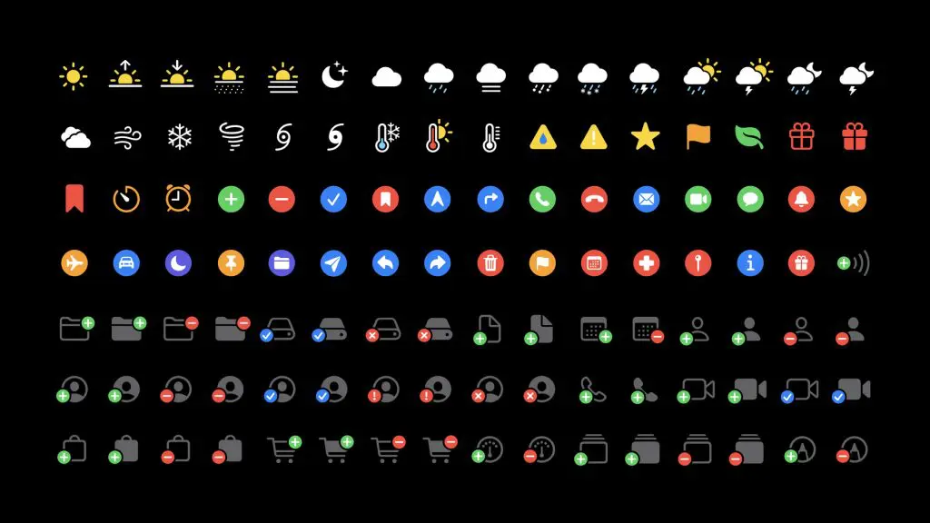
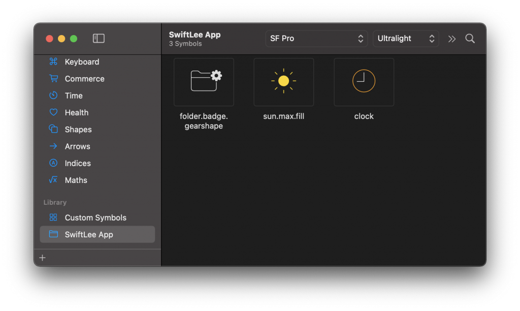
The app allows you to create a collection of symbols. This can be a great way to manage your app by making an overview of all used symbols:
Exporting a symbol
The Mac app allows you to support all symbols as an SVG using File -> Export Symbol... . This is a great way to include the symbol in places where you can not use the font itself. However, do keep in mind the license agreements.
Creating a custom SF symbol
You can create a custom SF symbol whenever no symbol matching your requirements is available. The exported SVG version provides a well-structured base for creating your custom symbol.
The Create custom symbols session from WWDC 2021 gives an in-depth explanation of how to create custom symbols
Choosing the right symbol as a base reference
It’s best to start with a symbol close to your desired one. Do know that SF Symbols include copyrighted ones, and you can’t use replicas of Apple products and features or reproduce them in your custom symbols. An info glyph badge marks such symbols, and you can identify them within the app’s inspector pane.
Once you find a symbol that’s close to what you need, you can right-click it and select “Duplicate as Custom Symbol.” This will move the symbol into the custom symbols collection, from which you can start editing right inside the SF Symbols app.
Most of the shapes are also available without an icon. For example the circle or circle.fill:
This is a great starting point for your custom symbol!
Editing a custom symbol from within the SF Symbols App
You don’t always need to go into Sketch or any other SVG editing app to create a custom symbol. You can also alter an existing SF Symbol from within the SF Symbols App. To do this, you’ll have to duplicate a symbol as a custom symbol and start editing. For example, you can choose to change the colors for the Multicolour rendering:
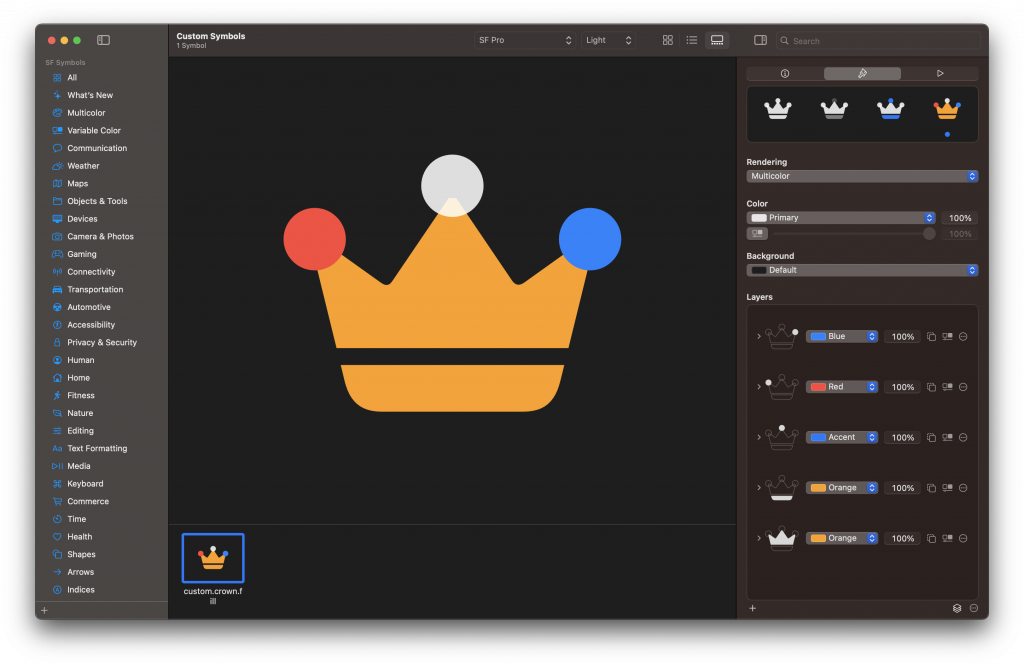
Each layer of the symbol can be dragged from the gallery overview to the layers list on the right side. Once added as a layer, you can alter its colors for each rendering mode. Another option could be to change its style for the Hierarchical rendering mode. By setting the second layer to Secondary, you’ll see that a slightly lighter gray is applied automatically:
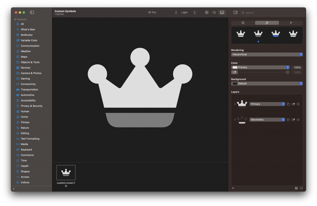
These adjustments can also be made for your custom symbols, making it easy to apply different colors to different layers.
Do I need to support all weights and scales?
Well, the more weights and scales you implement, the wider the range of text settings you’ll support. The minimum should be regular, medium, semibold, and bold at all scales so you can support Dynamic Type and the bold text setting.
How can I validate my custom SF Symbol?
The app allows you to validate the custom SF Symbol through the menu: File ➞ Validate Templates.... Navigate and select your custom symbol to start the validation.
Exporting and using the custom symbol
Once you have exported your symbol to an SVG, you can simply drag it into your Asset Catalog in Xcode.
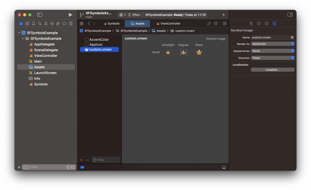
It previews your symbol, allowing you to configure its name, appearance, direction, and localization.
Conclusion
With over 6000 symbols to use for free in our apps, we can feel fortunate as Apple engineers. Especially if you don’t have a designer or want to move fast, you can use SF symbols to build a beautiful native app. The SF Symbol app is excellent for finding the correct symbol for your task.
If you like to improve your Swift knowledge, even more, check out the Swift category page. Feel free to contact me or tweet to me on Twitter if you have any additional tips or feedback.
Thanks!