Dark Mode was introduced in iOS 13 and announced at WWDC 2019. It adds a darker theme to iOS and allows you to do the same for your app. It’s a great addition to give to your users so they can experience your app in a darker design.
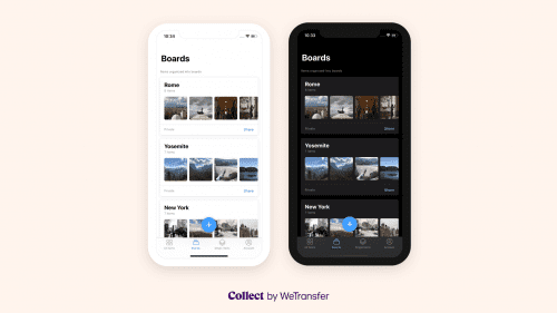
In this blog post, I’ll share with you my experiences after we’ve added Dark Mode support to the Collect by WeTransfer app.

Opt-out and disable Dark Mode
Before we dive into the adoption of the Dark interface style I want to shortly tell you how you can opt-out. Once you start building your app using Xcode 11 you’ll notice that the darker appearance is enabled by default.
If you don’t have the time to add support for Dark mode you can simply disable it by adding the UIUserInterfaceStyle to your Info.plist and set it to Light.
Overriding Dark Mode per view controller
You can override the user interface style per view controller and set it to light or dark using the following code:
class ViewController: UIViewController {
    override func viewDidLoad() {
        super.viewDidLoad()
        overrideUserInterfaceStyle = .dark
    }
}
Overriding Dark Mode per view
You can do the same for a single UIView instance:
let view = UIView()
view.overrideUserInterfaceStyle = .dark
Overriding Dark Mode per window
Overriding the user interface style per window can be handy if you want to disable Dark Mode programmatically:
UIApplication.shared.windows.forEach { window in
    window.overrideUserInterfaceStyle = .dark
}
Note that we’re making use of the windows array here as the keyWindow property on the shared UIApplication is deprecated starting from iOS 13. It’s discouraged to use it as applications can now support multiple scenes that all have an attached window.
Enabling Dark Mode for testing
If you start implementing a darker appearance in your app it’s important to have a good way of testing. There are multiple ways to enable and switch appearance mode that all have their benefits.
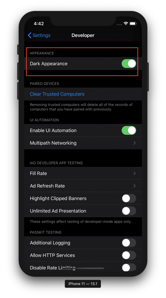
Enabling Dark Mode in the simulator
Navigate to the Developer page in the Settings app on your simulator and turn on the switch for Dark Appearance:
Enabling Dark Mode on a device
On a device, you can enable Dark Mode by navigating to the Display & Brightness page in the Settings app. However, it’s a lot easier during development to add an option to the Control Centre to quickly switch between dark and light mode:
Switching Dark Mode from the debug menu
While working in Xcode with the simulator open you might want to use the Environment Overrides window instead. This allows you to quickly switch appearance while debugging:
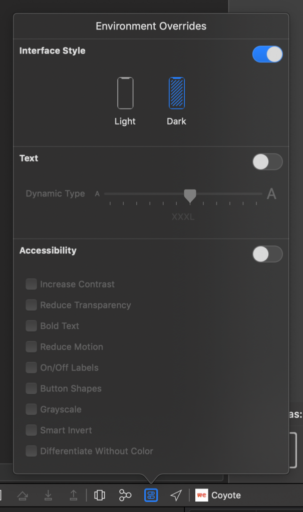
Note: If you don’t see this option you might be running on an iOS 12 or lower device.
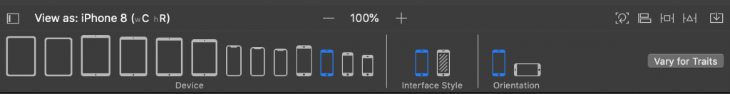
Enabling Dark Mode in Storyboards
While working on your views inside a Storyboard it can be useful to set the appearance to dark inside the Storyboard. You can find this option next to the device selection in the bottom:
Overriding Dark Mode in views, view controllers, and windows
The previous section covered the enabling and disabling of Light Mode throughout the whole app using the Info.plist or disabling it per view, view controller or window. This is a great way if you temporary want to force the Dark appearance for testing purposes.

FREE 5-Day Email Course: The Swift Concurrency Playbook
A FREE 5-day email course revealing the 5 biggest mistakes iOS developers make with with async/await that lead to App Store rejections And migration projects taking months instead of days (even if you've been writing Swift for years)
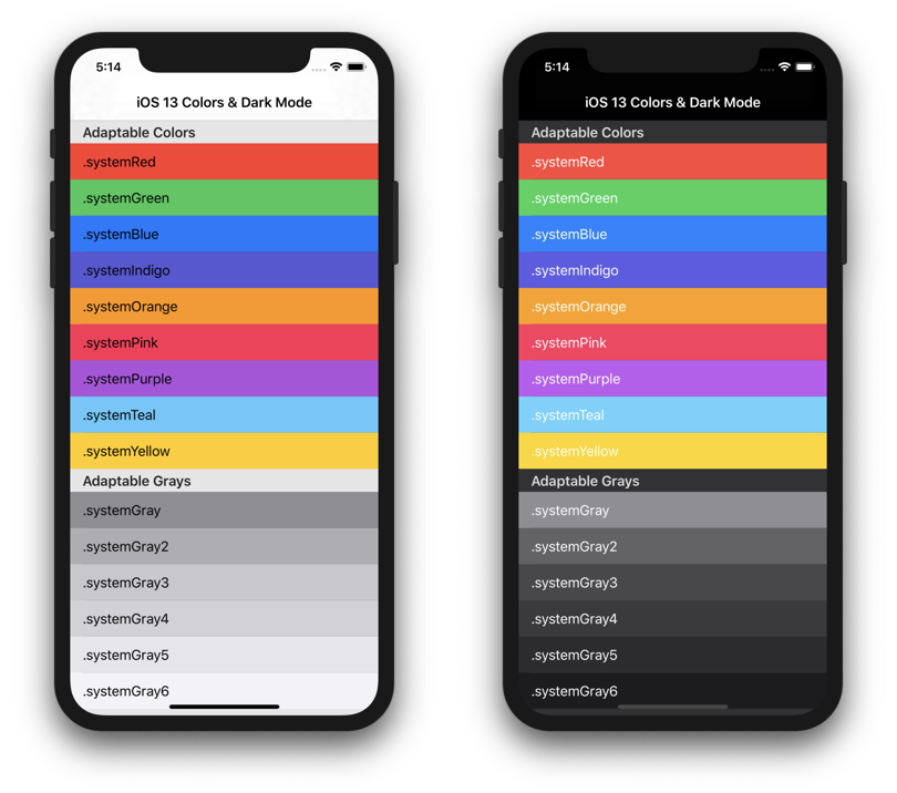
Adjusting colors for Dark Mode
With Dark Mode on iOS 13, Apple also introduced adaptive and semantic colors. These colors adjust automatically based on several influences like being in a modal presentation or not.
Adaptive colors explained
Adaptive colors automatically adapt to the current appearance. An adaptive color returns a different value for different interface styles and can also be influenced by presentation styles like a modal presentation style in a sheet.
Semantic colors explained
Semantic colors describe their intentions and are adaptive as well. An example is the label semantic color which should be used for labels. Simple, isn’t it?
When you use them for their intended purpose, they will render correctly for the current appearance. The label example will automatically change the text color to black for light mode and white for dark.
It’s best to explore all available colors and make use of the ones you really need.
Exploring adaptive and semantic colors
If possible, it will be a lot easier to adopt Dark Mode if you’re able to implement semantic and adaptive colors in your project. For this, I would highly recommend the SemanticUI app by Aaron Brethorst which allows you to see an overview of all available colors in both appearances.
Supporting iOS 12 and lower with semantic colors
As soon as you start using semantic colors you will realize that they only support iOS 13 and up. To solve this we can create our own custom UIColor wrapper by making use of the UIColor.init(dynamicProvider: @escaping (UITraitCollection) -> UIColor) method. This allows you to return a different color for iOS 12 and lower.
public enum DefaultStyle {

    public enum Colors {

        public static let label: UIColor = {
            if #available(iOS 13.0, *) {
                return UIColor.label
            } else {
                return .black
            }
        }()
    }
}

public let Style = DefaultStyle.self

let label = UILabel()
label.textColor = Style.Colors.label
Another benefit of this approach is that you’ll be able to define your own custom Style object. This allows theming but also makes your color usage throughout the app more consistent when forced to use this new Style configuration.
Creating a custom semantic color
A custom semantic color can be created by using the earlier explained UIColor.init(dynamicProvider: @escaping (UITraitCollection) -> UIColor) method.
Often times, your app has its own identical tint color. It could be that this color works great in Light mode but less in Dark. For that, you can return a different color based on the current interface style.
public static var tint: UIColor = {
    if #available(iOS 13, *) {
        return UIColor { (UITraitCollection: UITraitCollection) -> UIColor in
            if UITraitCollection.userInterfaceStyle == .dark {
                /// Return the color for Dark Mode
                return Colors.osloGray
            } else {
                /// Return the color for Light Mode
                return Colors.dataRock
            }
        }
    } else {
        /// Return a fallback color for iOS 12 and lower.
        return Colors.dataRock
    }
}()
Dark mode can be detected by using the userInterfaceStyle property on the current trait collection. When it’s set to dark you know that the current appearance is set to dark.
Border colors are not dynamically updating for Dark Mode
When you use adaptive colors with CALayers you’ll notice that these colors are not updating when switching appearance live in the app. You can solve this by making use of the traitCollectionDidChange(_:) method.
override func traitCollectionDidChange(_ previousTraitCollection: UITraitCollection?) {
    super.traitCollectionDidChange(previousTraitCollection)
    /// Border color is not automatically catched by trait collection changes. Therefore, update it here.
    layer.borderColor = Style.Colors.separator.cgColor
}
Updating Assets and Images for Dark Mode
Once you’re done with updating all the colors it’s time to update the assets in your app.
The easiest way to do this is by using an Image Asset Catalog. You can add an extra image per appearance.
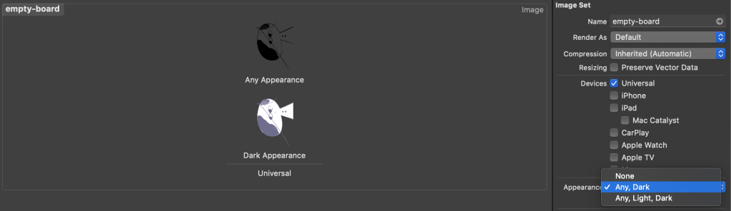
This makes your image adaptive as well and adjust the image accordingly for the current interface style.
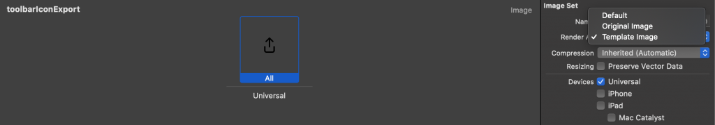
Applying a tint color to images and icons
It’s not always the best option to add extra assets for each appearance. In the end, it makes your app size bigger.
Therefore, a good alternative is to look for images that can be used with a tint color. This especially works great with icons that are used in, for example, toolbars and tab bars.
First, you need to make the asset render as template:
You could do the same in code:
let iconImage = UIImage()
let imageView = UIImageView()
imageView.image = iconImage.withRenderingMode(.alwaysTemplate)
After that, you can simply set the image view tint color to make the icon adjust its color based on the current appearance:
imageView.tintColor = Style.Colors.tintInverting colors as a solution for images
Inverting colors can be another way to save app size. This does not always work for each image but can be a solution that prevents you from adding another asset to your bundle.
You can do this by making use of the following UIImage extension:
extension UIImage {
    /// Inverts the colors from the current image. Black turns white, white turns black etc.
    func invertedColors() -> UIImage? {
        guard let ciImage = CIImage(image: self) ?? ciImage, let filter = CIFilter(name: "CIColorInvert") else { return nil }
        filter.setValue(ciImage, forKey: kCIInputImageKey)

        guard let outputImage = filter.outputImage else { return nil }
        return UIImage(ciImage: outputImage)
    }
}
You need to update your image manually when the appearance is updated. Therefore, it’s recommended to use the method as follows:
// MARK: - Dark Mode Support
private func updateImageForCurrentTraitCollection() {
    if traitCollection.userInterfaceStyle == .dark {
        imageView.image = originalImage?.invertedColors()
    } else {
        imageView.image = originalImage
    }
}

override func traitCollectionDidChange(_ previousTraitCollection: UITraitCollection?) {
    super.traitCollectionDidChange(previousTraitCollection)
    updateImageForCurrentTraitCollection()
}
Using a custom operator to switch between two colors
In some cases, you want to define two colors inline for both light and dark mode. Custom operators can help us do this relatively simple:
infix operator |: AdditionPrecedence
public extension UIColor {

    /// Easily define two colors for both light and dark mode.
    /// - Parameters:
    ///   - lightMode: The color to use in light mode.
    ///   - darkMode: The color to use in dark mode.
    /// - Returns: A dynamic color that uses both given colors respectively for the given user interface style.
    static func | (lightMode: UIColor, darkMode: UIColor) -> UIColor {
        guard #available(iOS 13.0, *) else { return lightMode }

        return UIColor { (traitCollection) -> UIColor in
            return traitCollection.userInterfaceStyle == .light ? lightMode : darkMode
        }
    }
}
This custom operator allows us to define a dynamic color that adopts automatically as follows:
let lightModeColor = .black
let darkModeColor = .white
let dynamicColor = lightModeColor | darkModeColorConclusion
We covered a lot of tips for adapting Dark Mode in your app. We also explained the benefits of using Semantic and Adaptive Colors. Hopefully, this helped you to implement Dark Mode a bit more efficient!
As you’re busy working with assets, either way, you might want to clean up your unused assets directly as well! If you like to improve your Swift knowledge, even more, check out the Swift category page. Feel free to contact me or tweet to me on Twitter if you have any additional tips or feedback.
Thanks!