A SwiftUI Toggle is a common UI element that allows users to switch between states. It often turns a binding value on or off, and it’s commonly used for settings or binary choices.
In this guide, I’ll walk through everything you need to know about a Toggle in SwiftUI: from the basics to customization, accessibility, and real-world usage patterns.

The basics of a SwiftUI Toggle
A SwiftUI Toggle is initialized with a label and a binding to a boolean value. When the user flips the switch, the bound value updates automatically. A code example looks as follows:
struct ContentView: View {
@State private var isEnabled = false
var body: some View {
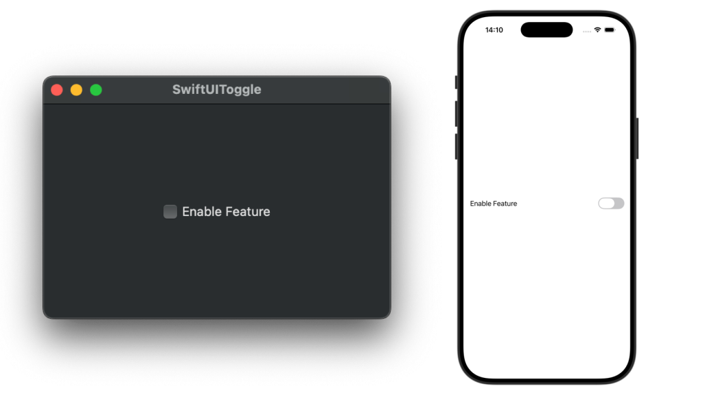
Toggle("Enable Feature", isOn: $isEnabled)
}
}The label “Enable Feature” is displayed next to the switch. The isOn property updates $isEnabled whenever the value changes. This works two ways:
- If you update
isEnabledfrom code, the switch will update - If you flip the switch,
isEnabledwill update
In terms of UI, the above example looks as follows:
Using a custom label
By default, Toggle supports text, but you can use any view as its label. For example, this is what I use for RocketSim:
Toggle(isOn: $isEnabled) {
    HStack {
        Image(systemName: "airplane")
        Text("Simulator Airplane Mode")
    }
}
This allows you to create a richer, more dynamic experience that responds to state changes.
Using Toggles without labels
In some cases, you don’t want to show any label. In this case, you can use the labelsHidden() SwiftUI modifier:
Toggle("", isOn: $isEnabled)
    .labelsHidden()
Accessibility considerations
Toggles automatically come with accessibility traits, but if you hide labels, make sure you provide context:
Toggle("", isOn: $isEnabled)
    .labelsHidden()
    .accessibilityLabel("Enable Feature")
This ensures features like VoiceOver still understand what the toggle does. However, you could do the same by just using the toggle’s label:
Toggle("Enable Feature", isOn: $isEnabled)
    .labelsHidden()
As it will set the accessibility label accordingly using the input text “Enable Feature”.
FREE 5-Day Email Course: The Swift Concurrency Playbook
A FREE 5-day email course revealing the 5 biggest mistakes iOS developers make with with async/await that lead to App Store rejections And migration projects taking months instead of days (even if you've been writing Swift for years)
Using custom Toggle styles in SwiftUI
SwiftUI comes with built-in styles for toggles. The default SwitchToggleStyle is what you’ve seen in the above screenshot. You can configure it in two ways:
Toggle("Enable Feature", isOn: $isEnabled)
    .toggleStyle(SwitchToggleStyle())

    /// Or:
    .toggleStyle(.switch)
The latter is more modern and utilizes Static Member Lookup in Generic Contexts. There are several styles to pick from:
- button: A toggle style that displays as a button with its label as the title.
- switch: A toggle style that displays a leading label and a trailing switch.
- checkbox: A toggle style that displays a checkbox followed by its label (only available on macOS).
- automatic: Uses checkbox on macOS, switch on all other platforms.
While you might use a checkbox on macOS, it’s becoming more common to use a switch style there as well.
Grouping Toggles in Forms
Toggles are often used inside a SwiftUI Form, especially for settings screens:
Form {
Section("Notifications") {
Toggle("Enable Push Notifications", isOn: $isEnabled)
Toggle("Play Sound", isOn: $playSound)
}
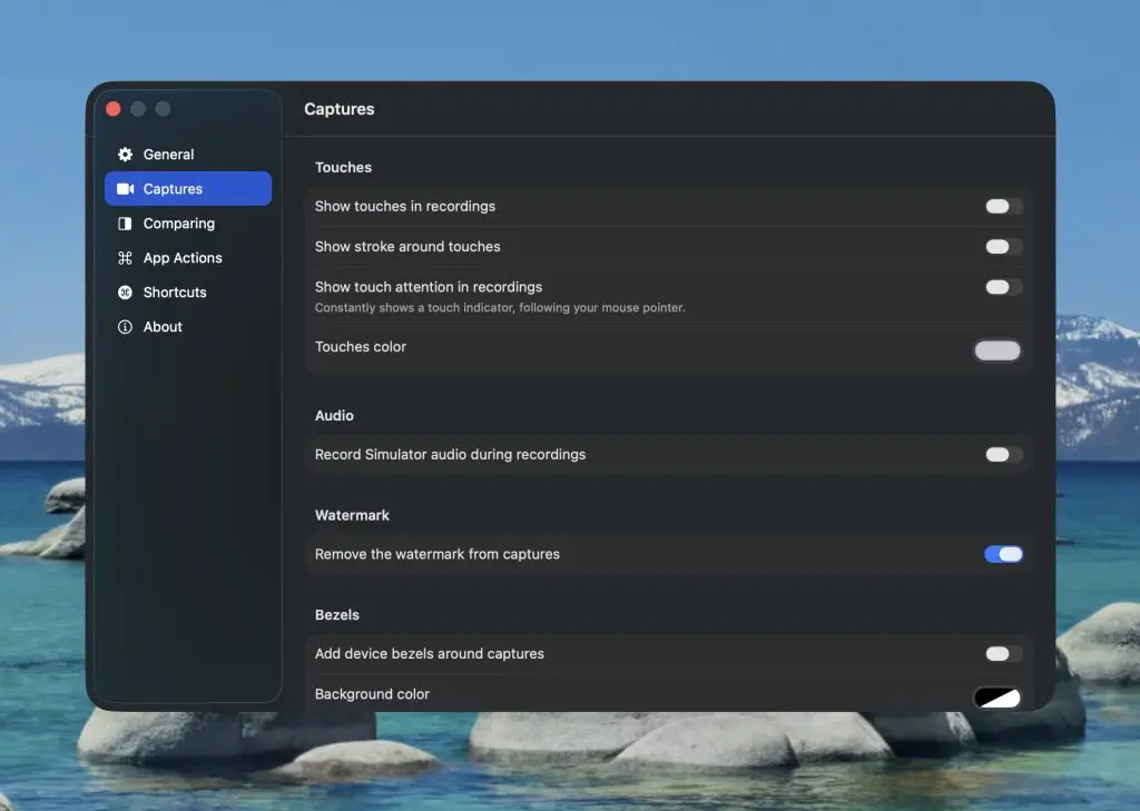
}A Form gives you automatic styling that feels at home in e.g., iOS or macOS Settings. For example, this is how the settings on macOS Tahoe for RocketSim utilize a Form and Toggles:
Advanced: Binding to derived state
You don’t always need to bind directly to a @State property. Toggles can also be bound to computed bindings using the Binding initializer as follows:
Toggle("Simulator Airplane Mode", isOn: Binding(
    get: {
        UserDefaults.standard.bool(forKey: "simulator_airplane_mode")
    },
    set: { newValue in
        UserDefaults.standard.set(newValue, forKey: "simulator_airplane_mode")
    }
))
Though, in this case, it’s obviously better to make use of @AppStorage. However, it demonstrates the idea well!
Conclusion
A SwiftUI Toggle allows users to switch between states. It’s a common UI element on all platforms and a great way to provide in-app settings. Using standard styles and custom labels, you’ll be able to use them in a way that fits your app’s styling.
If you want to improve your SwiftUI knowledge, even more, check out the SwiftUI category page. Feel free to contact me or tweet me on Twitter if you have any additional tips or feedback.
Thanks!