Icon Composer is Apple’s recommended tool for generating app icons for all the latest OS versions. It’s bundled with Xcode and lets you apply glass effects and a composition that aligns with the newest design.
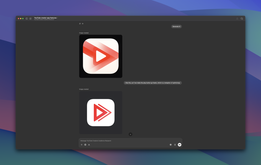
While working on my app for the From App Idea to 10K MRR YouTube Series, I asked AI to generate an app icon for me. While it worked great (compared to my design skills), the app icon was far from ready for production. On top of that, it wasn’t layered, and I couldn’t use it inside Icon Composer. That’s why I decided to invite Michael Flarup to share us how to professionally create a great looking app icon.
Generating an app icon using AI
The first thing I did was ask ChatGPT to generate an app icon for me. I was deep inside a custom GPT project, one that was very knowledgeable about the app idea I’m building. This is a big win, since it can reason well about app icons that fit the app concept.
I don’t think ChatGPT is the best AI platform for generating app icons. In fact, I don’t think any AI platform is currently good enough to generate a professional app icon (feel free to challenge me!). However, it’s great for inspiration and it can truly help you get things started.

In a way, I liked the concept. Note that this changed drastically after chatting with Michael, but I wasn’t biased at that point. The play icon kind of accelerates, it improves, or optimizes, or goes faster. The idea is that my app optimizes YouTube videos, so the app icon felt like a good fit. When reviewing the AI-generated app icon with Michael, you could say he wasn’t completely convinced.
The problem with AI-generated App Icons
I asked Michael about the problem with AI-generated App Icons. This is what he shared:
The problem with AI icons isn’t that they look bad — it’s that they look good enough too quickly. That instant gratification is seductive, especially when you’re deep in building your app, and you just want something presentable so you can move on.
You prompt, you generate, you tweak the colors, and suddenly you have an icon in minutes. But that speed comes with a hidden cost: you skip the uncomfortable part of the process where great icons are actually born — exploration, research, and intention.
And yes, I’ll be honest: I wasn’t planning to do that at all. I’m focused on developing the app, and I want to move on at this point.
AI has a habit of pushing you into the first concept that feels acceptable, which means you lock in early and stop asking the most important question: why would this icon connect with the people I want to reach?
Even when an AI icon looks polished, it often lacks the one thing that makes an icon feel premium: a human decision behind it. It might resemble familiar patterns, or mimic the style of popular apps, but it rarely carries a story. And story is what gives an icon personality — the subtle narrative that makes it memorable, clickable, and trustworthy. AI tends to produce “average” by design: it blends trends, repeats motifs, and optimizes toward what already exists. That can be fine for placeholders or early prototypes, but if your app is aiming for perceived value — the kind that makes people trust your product instantly — then the icon can’t just be visually nice. It has to feel intentional. And that’s where AI icons often fall short.
While we can direct AI to make ‘human decisions’ for us, it will never feel as polished as one made after a designer carefully takes care of the details. We’re not even talking about Icon Composer here; this is solely the concept creation, the foundation of the icon itself.
The impact of Icon Composer
The AI-generated app icon was simply flat. It used to be like that back in the days, but we now have Icon Composer, which allows us to bring icons to life. It’s fascinating to think about an AI tool that generates Icon Composer files for us, and that knows how to apply composition and layer effects and such, but we’re not there yet.
During my session with Michael, he told me it wouldn’t be an in-depth session. The reality is that I was pretty impressed by the outcome. The app icon he generated looks so much better, has multiple layers, has a design feel like the latest OS, and definitely feels ready for production.
Now, I don’t simply want to drop the optimized app icon here. There’s a story behind the icon I want you to know, as it will better explain the process of creating a high-quality app icon. If you haven’t done so yet, I would really encourage you to watch the whole session.
From App Idea to 10K MRR
The Icon Composer session is just one of many episodes I’m recording. If you don’t know yet: I’m trying to convert an app idea into a 10K MRR (Monthly Recurring Revenue) successful product. Along the way, I’m recording the process, so you can learn from my experience and decisions.
Ready to dive in?
Here’s the first episode:
Conclusion
AI is moving fast, and I’m sure it will do great at generating app icons in the future. Today, however, I don’t think we’re there yet and the impact of design experience is high. Icon Composer is a great tool for optimizing app icons into one that fits the latest designs.