

As soon as the iPhone Duo got announced, we were all waiting for an iPhone Duo Simulator inside Xcode. We eventually got it with the first beta of Xcode 27.1. This Simulator is unlike any other and a lot of fun to explore, allowing you to fold the device into different angles while watching your app adapt.
Yet, it also means we have to adjust our apps for different display sizes and poses. You can start by making your app resize correctly or go the extra mile to benefit from the unique device capabilities that ship with iPhone Duo. In this article, I’ll help you optimize your app as far as you want to go.

How to install the iPhone Duo Simulator
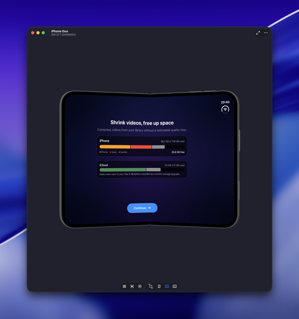
To start testing your app on the iPhone Duo Simulator, you need to download Xcode 27.1. Note that just downloading might not be enough, as users reported they had to go into Settings → Components to click on an “Update” button next to iOS 27.1.
Once installed, the iPhone Duo shows up like any other destination and you can build and run your app on it. There are new toolbar buttons at the bottom that allow you to fold or unfold the device.
Holding Option ⌥ reveals a slider that you can use to control the hinge angle of the device with precision:
Making your app resizable for iPhone Duo
Making your app resizable is the first step toward supporting iPhone Duo. The device does not provide one fixed canvas: your app can move between the outer and inner displays, rotate, enter Split View, or resize while the device opens and closes.
Your layout should respond to the available space rather than checking whether it runs on iPhone Duo. Avoid basing decisions on a device identifier, orientation, or a fixed screen width. Those checks quickly become incorrect once your app moves to another display or shares the screen with another app. Making your app resizable also allows you to benefit from running on Apple Silicon Macs.
SwiftUI’s system containers already handle many of these transitions. A NavigationSplitView, for example, can present multiple columns when enough room is available and adapt its presentation for a smaller display:
struct ContentView: View {
    var body: some View {
        NavigationSplitView {
            SidebarView()
        } detail: {
            DetailView()
        }
    }
}
You can use ViewThatFits when your content can switch between horizontal and vertical arrangements:
struct AdaptiveContentView: View {
    var body: some View {
        ViewThatFits(in: .horizontal) {
            HStack {
                PreviewView()
                ControlsView()
            }

            VStack {
                PreviewView()
                ControlsView()
            }
        }
    }
}
This approach is not specific to iPhone Duo, which is exactly what makes it valuable. The same layout continues to work in Split View, on iPad, in a resizable window, and on future devices with different dimensions.
You should also avoid using UIScreen.main.bounds to determine your layout. An iPhone Duo has multiple displays, making the concept of one main screen ambiguous. Prefer the space SwiftUI offers through its layout system, environment values, and container views.
Lastly, make sure your content respects safe areas and layout margins. Insets can be asymmetric depending on the active display, device pose, and vertical toolbar placement. System containers account for these regions automatically, while custom layouts require additional attention.
Once your app resizes correctly, you have established basic iPhone Duo support. The next step is testing whether every feature remains accessible across the different displays and poses.
Testing your app across different iPhone Duo poses
Running your app once on the inner display is not enough to confirm iPhone Duo support. The real test is whether your interface remains usable while the available space changes.
Start with your app on the outer display and navigate several screens deep. Open a sheet, select an item, scroll through a list, or enter text into a form. Then unfold the device while your app is still running and verify that its state remains intact. You basically want to do this for every screen, as a user could do this too.
I recommend testing at least the following scenarios:
- Launch your app on the outer display.
- Move from the outer to the inner display.
- Fold and unfold the device while your app is running.
- Pause at different hinge angles.
- Rotate the device in both folded and unfolded states.
- Use your app alongside another app in Split View.
- Present sheets, alerts, menus, and the keyboard.
- Verify that scrolling content and controls remain accessible.
- Confirm that navigation and selection state are preserved.
Pay extra attention to custom layouts. A view that looks correct when the device is fully open might place content underneath the fold when partially closed. Fixed frames can start clipping, while overlays and floating buttons might end up outside the available space.
Safe-area values can also differ between opposite sides of the screen. Do not assume that leading and trailing insets are equal. The active camera, fold, toolbar position, and display configuration can all influence the space available to your app.
The most valuable tests involve changing the device pose while interacting with your app. Static screenshots can confirm the final layout, but they will not reveal state loss, interrupted animations, or views that briefly jump into the wrong position. If your app remains functional throughout these transitions, you already provide solid basic support. You can then decide whether specific screens benefit from adapting their content around the fold using the new iPhone Duo APIs.
Creating adaptive layouts with ArrangementView
Making your app resizable ensures that it remains functional, but some screens can benefit from treating the two available regions independently. Apple introduced ArrangementView in iOS 27.1 for layouts containing a primary and secondary view.
A video player is a good example. The video and its playlist are related, but they do not have to remain in the same fixed arrangement. You can show them side by side when enough horizontal space is available and let the system find a better arrangement in other configurations:
struct AdaptivePlayerView: View {
    var body: some View {
        if #available(iOS 27.1, *) {
            ArrangementView {
                PlayerView()
            } secondary: {
                PlaylistView()
            }
            .arrangementViewStyle(.split)
        } else {
            ViewThatFits {
                HStack {
                    PlayerView()
                    PlaylistView()
                }

                VStack {
                    PlayerView()
                    PlaylistView()
                }
            }
        }
    }
}
The .split style works well when both regions should remain visible without covering each other. Think of a video and its controls, an editor and its inspector, or a document and its supporting information.
You can use the .overlay style when the secondary view is allowed to appear on top of the primary content:
.arrangementViewStyle(.overlay)Not every two-column interface needs an ArrangementView. SwiftUI containers like NavigationSplitView, TabView, List, and ScrollView already adapt to the available space. I would only introduce an arrangement when your screen contains two custom regions that currently require an HStack, VStack, or ZStack to position correctly.
As an example, I’ve updated an onboarding screen in my Video Compression app to adjust the order and show the storage examples on the top instead of middle:
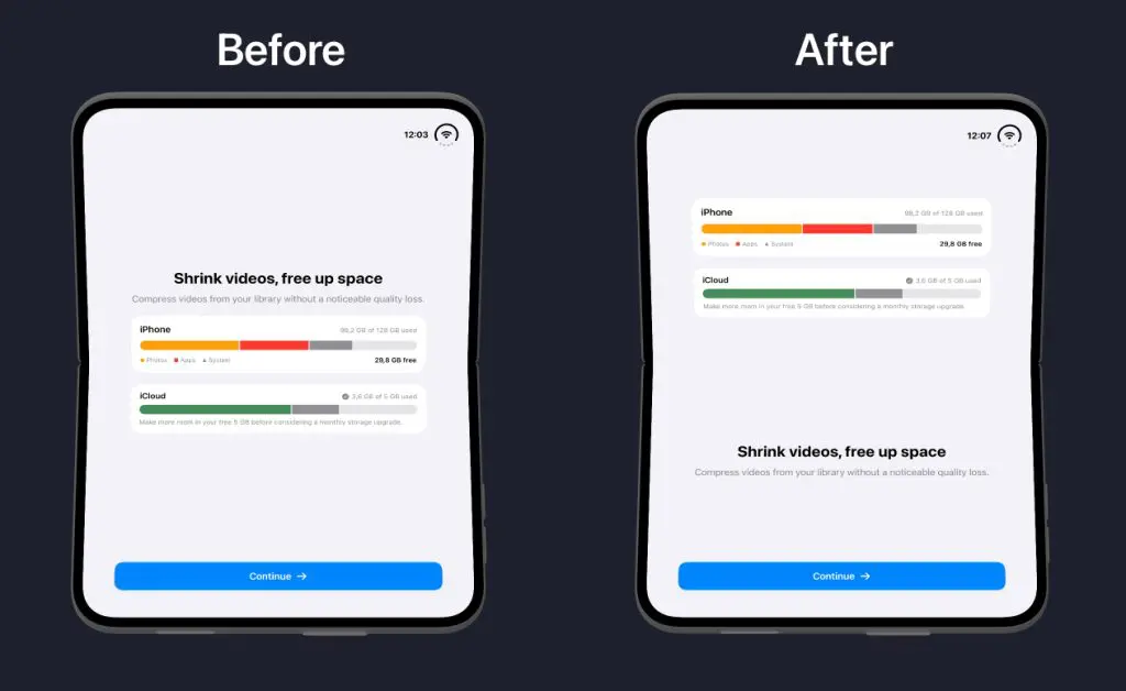
Your app might support versions before iOS 27.1, so make sure both regions remain available even when ArrangementView cannot be used. Apple demonstrates more arrangement patterns in Strike a pose with adaptive layouts on iPhone Duo.
Avoiding the fold with reserved regions
System containers automatically account for most hardware regions. However, a custom edge-to-edge interface might still place an important control underneath the fold or camera.
SwiftUI represents these areas as reserved regions. You can query them through a GeometryProxy:
GeometryReader { proxy in
    let divisions = proxy.reservedRegions(kind: .division)
    let occlusions = proxy.reservedRegions(kind: .occlusion)

    CustomCanvas(
        divisionFrames: divisions.map(\.frame),
        occlusionFrames: occlusions.map(\.frame)
    )
}
A division separates your interface into multiple usable regions. The active fold on the inner display is an example of a division. You can use its frame to move or resize a coherent group of views instead of allowing content to span the fold.
An occlusion covers a smaller part of the available space. The inner camera is an example: content can continue surrounding it, but important controls and information should stay outside its frame.
Each reserved region provides a frame, margins, and an isActive state. Queries return active regions by default, which is usually what you want. You can include inactive regions when making a higher-level layout decision:
let possibleDivisions = proxy.reservedRegions(
    kind: .division,
    options: .includeInactive
)
An inactive region does not currently obstruct your interface and might return a zero-sized frame. Make sure to check isActive before moving content around it.
I would only query reserved regions after confirming that standard SwiftUI containers cannot solve the problem. A List, ScrollView, sheet, alert, or navigation container already adapts around the fold and system interface. Manually displacing their content can make transitions feel less natural.
Reserved regions are most useful for custom canvases, games, media interfaces, or manually positioned controls. Keep the movement small and preserve the relationship between related elements. Your interface should feel like the same screen adapting, rather than a completely different layout appearing for every pose.
Note that all these APIs require iOS 27.1. Keep your existing adaptive layout as a fallback for earlier versions and treat reserved regions as an enhancement rather than a requirement for basic iPhone Duo support. It’s very much putting the dots on the i! You can learn more in Apple’s Preparing your app for iPhone Duo documentation.
Responding to hinge changes
The hinge provides more than a fold to avoid. You can use its angle to create interactions or visual effects that respond while someone opens and closes the device.
SwiftUI provides the onHingeChange modifier for observing the current hinge context. The following example slightly scales artwork based on the folding angle:
@available(iOS 27.1, *)
struct HingeReactiveArtwork: View {
    @State private var foldEffect = 0.0

    var body: some View {
        ArtworkView()
            .scaleEffect(1 + foldEffect * 0.04)
            .onHingeChange { _, context in
                if let hinge = context.hinge,
                   hinge.status == .partiallyOpen {
                    foldEffect = min(
                        max(hinge.angle.degrees / 180, 0),
                        1
                    )
                } else {
                    foldEffect = 0
                }
            }
    }
}
The hinge is optional because the current device or display configuration might not provide one. Resetting the effect when the hinge becomes unavailable prevents your interface from getting stuck in an intermediate state.
I recommend using hinge changes for optional enhancements only. Examples include adjusting an animation, changing the perspective of artwork, controlling an interaction, or affecting audio based on the folding angle.
Do not use the raw hinge angle to decide your layout. Its update frequency and precision are not intended for positioning essential interface elements. Use size classes, ArrangementView, and reserved regions for layout decisions instead. Obviously, you should also keep the feature available when no hinge exists. The artwork in this example still works without its scale effect, allowing the same view to run on older iPhones and earlier operating systems.
Select the hinge-aware view behind an availability check and provide a regular fallback:
if #available(iOS 27.1, *) {
    HingeReactiveArtwork()
} else {
    ArtworkView()
}
Apple demonstrates more creative hinge interactions in Leverage multiple displays and scenes on iPhone Duo and you can learn more about availability checks here.
Adapting toolbars for iPhone Duo
Toolbars can appear vertically on iPhone Duo to preserve more space for your content. SwiftUI handles this automatically when you attach toolbar items to system containers like NavigationStack, NavigationSplitView, and TabView.
Make sure every toolbar action provides both a title and an icon:
struct PhotoEditorView: View {
    @Environment(\.dismiss) private var dismiss

    var body: some View {
        PhotoCanvasView()
            .toolbar {
                ToolbarItem(placement: .cancellationAction) {
                    Button("Close", systemImage: "xmark") {
                        dismiss()
                    }
                }

                ToolbarItem(placement: .topBarPinnedTrailing) {
                    Button("Export", systemImage: "square.and.arrow.up") {
                        exportPhoto()
                    }
                }
            }
    }

    private func exportPhoto() {
        // Export the edited photo
    }
}
The title remains important even when SwiftUI only displays the symbol. The system uses it for accessibility, expanded presentations, and overflow menus. This was the case even before the iPhone Duo arrived.
Semantic placements also help the system preserve a logical order. Cancellation and navigation actions belong near the leading edge, while prominent actions can use .topBarPinnedTrailing. Avoid positioning controls based on a physical edge, as the toolbar can move depending on the display and current configuration. Once again, these are pretty standard principles that always apply.
SwiftUI determines whether an item works in a vertical bar based on its content. Symbol-based controls generally adapt automatically, while title-only buttons and complex custom views might remain horizontal.
You can override this behavior for individual items when needed:
ToolbarItem {
    EditingModePicker()
}
.axisBehavior(.horizontalOnly)

ToolbarItem {
    CompactAdjustmentControl()
}
.axisBehavior(.verticalPreferred)
Use .horizontalOnly when a control cannot provide a meaningful vertical representation. Use .verticalPreferred when your custom control has a compact design that works well in either orientation. In most cases, leaving the behavior automatic produces the best result.
You can read toolbarVerticalEdge from the environment when a custom toolbar item needs to adjust its presentation:
@Environment(\.toolbarVerticalEdge)
private var toolbarVerticalEdge
A non-nil value means the current environment supports a vertical toolbar on that edge. Use it to select a compact representation, not to add manual safe-area spacing.
Most apps should keep automatic vertical toolbar behavior enabled. You can disable it using .toolbarVerticalBehavior(.disabled), but I would only do so for an interface that clearly works better with horizontal controls, such as a full-screen video player.
These APIs require iOS 27.1 and can be tested on the iPhone Duo Simulator. Your existing toolbar remains the fallback on earlier operating systems, allowing vertical behavior to remain a progressive enhancement. You can learn more about this all by reading Raise the bar with iPhone Duo.
Understanding the Simulator’s limitations
The iPhone Duo Simulator is great for testing layouts, display transitions, safe areas, vertical toolbars, and interactions based on the hinge angle. However, it does not replace testing on a physical device.
Camera workflows are the most important limitation. The Simulator cannot reproduce transitions between the outer, inner, and rear cameras. You also cannot validate direction-aware camera selection or camera capture accessories that display content on the outer screen (Yes, I am looking into Simulator Camera support for iPhone Duo).
A physical device remains necessary for testing:
- Camera selection and transitions.
- Content shown on the outer display during capture.
- Real-world touch reachability in partially folded poses.
- Haptic feedback and physical interactions.
- Performance, memory usage, and thermal behavior.
- The appearance of content on the actual folding display.
The iPhone Duo isn’t a cheap device, but Apple hosts several workshops with the opportunity to test your app on a physical device. And honestly, most of the support can be done reliably on the Simulator still. I like to compare it to building regular iPhone apps: you do want to test on a physical device eventually, but in most cases, you can develop on a Simulator alone.
Also be aware that the Xcode team is working hard on improving both Device Hub and the new simulator. I’m certain new features will land in future Xcode releases, and do take time to file your feedback. They take it serious, as they already fixed several of mine.
Reviewing iPhone Duo support with the SwiftUI Agent Skill
You can also use an AI agent to review your existing SwiftUI views for iPhone Duo support. I updated the SwiftUI Agent Skill to version 5.1.0 with dedicated guidance for resizable layouts, reserved regions, arrangements, hinge effects, and vertical toolbars.
For example, you can use the following prompt inside your project:
Review this SwiftUI view for iPhone Duo support.

Check whether it:
- Resizes correctly between compact and regular environments.
- Uses system containers before custom layout logic.
- Respects asymmetric safe areas.
- Benefits from ArrangementView or reserved regions.
- Supports vertical toolbar placement.
- Preserves functionality across display and pose changes.
- Provides fallbacks for APIs requiring iOS 27.1.

Do not use device detection, orientation, or the raw hinge angle to drive layout.
The skill helps your agent decide whether a view only needs general resizability or can benefit from one of the new iOS 27.1 APIs. It also prevents common mistakes, such as manually avoiding a fold that a system container already handles.
I prefer reviewing one screen at a time. Start with your most important custom layouts, then continue with screens containing toolbars, media, canvases, or manually positioned controls.
An agent review does not replace iPhone Duo Simulator testing. It can point out suspicious layout decisions and suggest modern APIs, but you should still run your app through the different display configurations yourself.
You can learn more about installing and using the skill in my SwiftUI Agent Skill article.
Apple’s iPhone Duo resources
Apple provides a dedicated iPhone Duo developer hub containing the latest documentation, videos, design guidance, and Xcode requirements.
I recommend starting with these written resources:
- Preparing your app for iPhone Duo explains the technical foundation, including resizing, reserved regions, arrangements, toolbars, and multiple displays.
- Designing for iPhone Duo covers continuity, reachability, adaptive layouts, and designing around the fold.
Apple also published six focused Tech Talks:
- Prepare your app for iPhone Duo covers the minimum work required to support the device.
- Raise the bar with iPhone Duo explains vertical toolbars, tab bars, and adaptive controls.
- Strike a pose with adaptive layouts on iPhone Duo introduces arrangements and reserved regions.
- Leverage multiple displays and scenes on iPhone Duo covers hinge interactions, additional windows, and content on multiple displays.
- Build a great camera experience for iPhone Duo explains camera selection, direction changes, and capture accessories.
- Design for iPhone Duo demonstrates how interfaces can remain familiar while adapting to the device’s different poses.
I would start with “Prepare your app” and “Strike a pose.” Together, they cover the resizable foundation and the new layout APIs most SwiftUI apps need. You can then continue with the toolbar, multiple-display, camera, or design sessions based on your app’s functionality.
Since the iOS 27.1 SDK is still in beta, revisit these resources when Apple releases the final version. APIs, Simulator limitations, and recommended behavior can still change before iPhone Duo ships.
Conclusion
Supporting iPhone Duo starts with making your app resizable. SwiftUI’s system containers already handle many display changes, allowing you to focus on testing whether navigation, controls, and content remain accessible across different poses. You can then adopt ArrangementView, reserved regions, vertical toolbars, and hinge effects where they genuinely improve the experience. These APIs should enhance your existing interface rather than introduce a completely different app for each device configuration.
The iPhone Duo Simulator makes this process surprisingly fun. It allows you to discover layout issues while exploring interactions that were not possible on previous iPhones.
If you want to improve your SwiftUI knowledge even more, check out the SwiftUI category page. Feel free to contact me or tweet me on Twitter if you have any additional tips or feedback.
Thanks!