Adding accessibility support in SwiftUI will be more approachable for you compared to UIKit. But still, if you’ve been sharpening your UIKit skills for years, it takes a while to get your head around the new declarative/reactive way of doing things. It is an entirely different mental model, and it takes some getting used to. You may have a good understanding of how to make UIKit apps accessible while struggling to do the same in SwiftUI.
I’ve invited over Dani for this guest article to bring you to improve your accessibility-related knowledge. Follow his #365DaysIOSAccessibility hashtag on Twitter to gain even more updates.

It’s worth doing a quick comparison by looking at adding the same accessibility support from UIKit into SwiftUI. We’ll also check out some other things that are just not available in UIKit, but you’ll wish they were.
Accessibility Traits
When working with accessibility traits, it is pretty common to add or remove traits depending on the state, and also to combine more than one trait when needed. You may have seen code like this before:
optionView.accessibilityTraits = .button

if option.isSelected {
    optionView.accessibilityTraits.insert(.header)
} else {
    optionView.accessibilityTraits.remove(.header)
}
Maybe you initialize the view as a button by default, and when you interact with it somewhere else in the code, you add/remove the .header trait. With SwiftUI, this is a bit different. You have both an .accessibilityAddTraits(_:) and an .accessibilityRemoveTraits(_:) modifier. Because SwiftUI is state-driven, the previous approach would just not work. Instead, you can do something like this:
.accessibilityAddTraits(isSelected ? [.isSelected, .isButton] : .isButton)It is a slight nuance, but something that made me scratch my UIKit head for sure while I was learning SwiftUI.
The set of traits available has changed between UIKit and SwiftUI too. In UIKit, there is a property called accessibilityViewIsModal, a boolean that, when set to true, makes VoiceOver ignore any sibling elements of the “modal” view. In SwiftUI, this has been simplified into a single .isModal trait.
There’s a set of UIKit traits that are not available in SwiftUI. You can achieve a similar result for two of them with SwiftUI’s accessibility modifiers.

FREE 5-Day Email Course: The Swift Concurrency Playbook
A FREE 5-day email course revealing the 5 biggest mistakes iOS developers make with with async/await that lead to App Store rejections And migration projects taking months instead of days (even if you've been writing Swift for years)
SwiftUI Modifiers replacing UIKit Accessibility Traits
In UIKit, we have the .adjustable accessibility trait causing VoiceOver to say “Adjustable” so the user knows that they can swipe up/down to modify its value. In SwiftUI, the trait wasn’t enough to set up the adjustable trait. You also needed to override accessibilityIncrement() and accessibilityDecrement() to handle these actions manually. This is the code you’d write to create an adjustable page control:
.accessibilityElement()
.accessibilityValue(Text("Page \(selectedIndex + 1) of \(numPages)"))
.accessibilityAdjustableAction { direction in
    switch direction {
    case .increment:
        guard selectedIndex < (numPages - 1) else { break }
        selectedIndex += 1
    case .decrement:
        guard selectedIndex > 0 else { break }
        selectedIndex -= 1
    @unknown default:
        break
    }
}
As you can see, everything you need to do in UIKit is now bundled in a single accessibility modifier: .accessibilityAdjustableAction(_:). If the user swipes up, it will invoke the action and fall into the increment case. We can increase the selected page number, which is also used in specifying the component’s accessibility value. Swiping down would decrease the page number.
For the .notEnabled UIKit’s accessibility trait, you can set any SwiftUI view as .disabled(true). That causes VoiceOver to say that a UI component is “Dimmed”, so a user knows that it is not possible to interact with it.
The last one is the .tabBar accessibility trait. And at this point, I believe there isn’t a replacement for it in SwiftUI.
Grouping
Grouping elements in UIKit is a very manual process. You can do it in a few different ways. But usually, you make a container view an accessibility element by setting its isAccessibilityElement property to true. You’ll follow up by configuring other properties like the accessibility label to represent the containing views.
In SwiftUI, there is a much more straightforward way. You can still take a similar approach by using .accessibilityElement(children: .ignore). Child views are ignored by default so you can just say .accessibilityElement(). You would need to configure a suitable accessibility label that properly represents all the child views since they’re now ignored.
An interesting addition in SwiftUI is the .combine parameter accessibilityElement(children: .combine). By using the combine parameter, SwiftUI automatically creates an accessibility label for your container view. Accessibility labels of the child views will be joined into a single label separated by commas. I wish I had something similar in UIKit!
Containers
You may have noticed VoiceOver saying “Tab Bar” after selecting a tab in the tab bar. However, moving focus outside the tab bar to one of the tabs VoiceOver won’t say you did. We could solve this in UIKit by setting the .semanticGroup accessibilityContainerType, to the tab bar, followed by configuring an accessibility label “Tab bar”.
In SwiftUI, you can use again the accessibilityElement(children:) modifier for this purpose using the .contain parameter. You’ll also need to specify an accessibility label for it:
.accessibilityElement(children: .contain)
.accessibilityLabel(Text(”Tab bar”))
New stuff!
There are a couple of other modifiers that don’t have UIKit counterparts and are worth mentioning.
The first one is accessibilityLabeledPair(role:id:in:). This is a very common scenario where you have some text and another component like a toggle next to it. Both components can be grouped, and the text in the label can be the accessibility label for the group. To be fair, I haven’t been able to use this one successfully yet. If anyone has experience with this one, I’d love to hear about it!
What we ended up doing for now in Stock Analyzer is using another of the new modifiers: accessibilityRepresentation(representation:). You can create custom components and make them accessible simply by passing a native component, a representation, that works in a similar way. In our case, our HStack containing both a label and a toggle will work exactly as a native toggle.
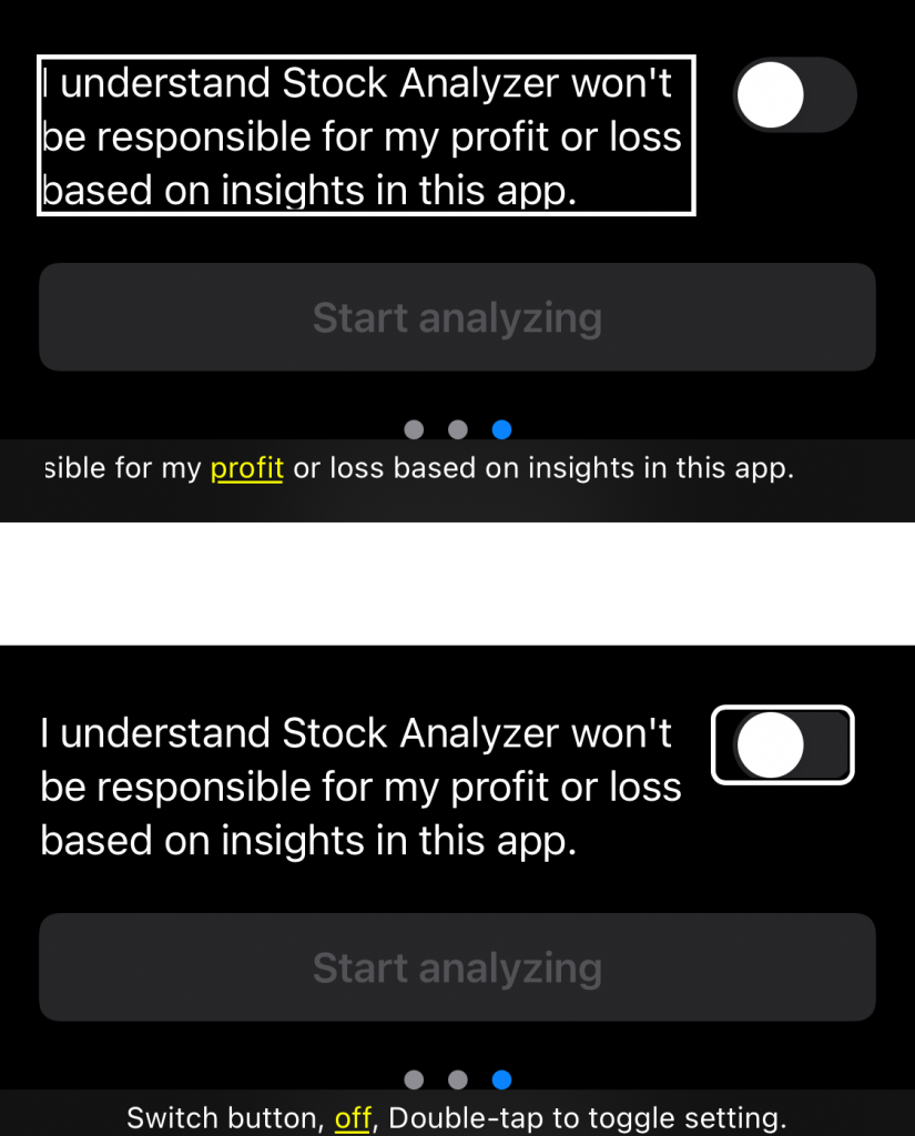
The label and the toggle will default to be two separate accessibility elements. The toggle will feel somewhat disconnected from the label.
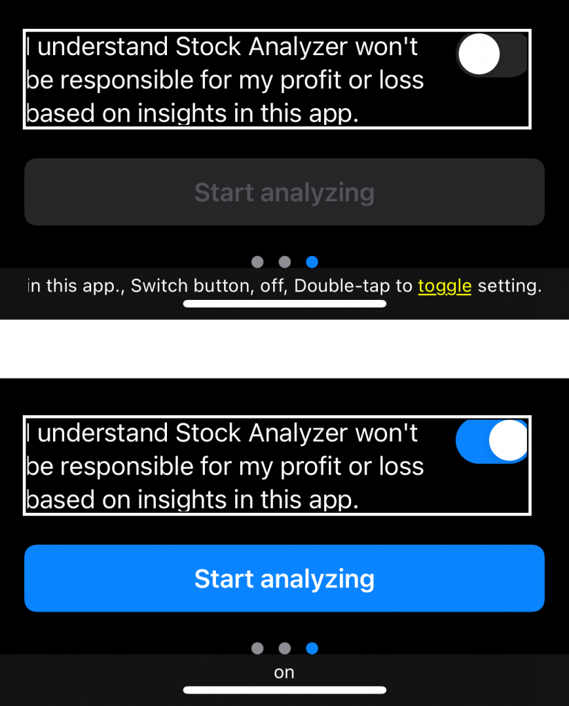
We can group the elements together and offer a better experience:
HStack(alignment: .top) {
    Text(agreementText)
        .accessibilityLabeledPair(role: .label, id: "agreementToggle", in: namespace)
    Toggle("", isOn: $checked)
        .fixedSize()
        .tint(Color.primaryTint)
        .accessibilityLabeledPair(role: .content, id: "agreementToggle", in: namespace)
}.accessibilityRepresentation {
    Toggle("", isOn: $checked).accessibilityLabel(Text(agreementText))
}
When interacting with the whole thing, it will act as if it was just a toggle that will change its value from off to on and vice versa:
Conclusion
As seen, it takes some adjustment in the way of thinking and some re-learning how to apply what we used to know for making accessible UIKit apps to continue doing it in SwiftUI. Overall, it is a similar accessibility model, and I think it proves how successful Apple was when designing its first accessibility APIs. Apple has baked accessibility into SwiftUI from day one, leading to a much better developing experience.
If you want to improve your accessibility knowledge, even more, check out the #365DaysIOSAccessibility hashtag. Feel free to contact Dani or tweet him, on Twitter if you have any additional tips or feedback.
Thanks!