SwiftUI Previews allow us to develop a lot faster as we can now preview our views live in Xcode. Whenever we change a piece of code, our preview will update and show the rendered change accordingly.
While developing a view that has to change into different appearances for certain states it helps a lot if you can preview those states at the same time. Knowing how to do this with Xcode Previews is even more valuable if you realize that you can do the same with UIKit views for your existing apps.

The default state of a SwiftUI preview in Xcode
In this example, we’re going to check the states of a share button that we have defined for the Collect by WeTransfer app. This is the app I’m developing during my day to day job and it has a few different states to consider:
- The color needs to update slightly in dark mode
- The “share” text label is localized and needs to change into “deel” which is the Dutch translation
- As it’s a call to action, we want to make sure it’s correctly adjusting for dynamic type sizes
The SwiftUI code for this button looks as follows:
struct ShareButtonView: View {
    var body: some View {
        Button(action: {
            print("Sharing")
        }) {
            Text("button.share.title")
                .font(.body)
                .padding(EdgeInsets(top: 5, leading: 10, bottom: 5, trailing: 10))
                .background(Color(UIColor.systemBlue))
                .cornerRadius(15)
                .foregroundColor(.white)
        }
    }
}
It’s a rounded button with a bit of padding and a blue background color. The default preview looks as follows:
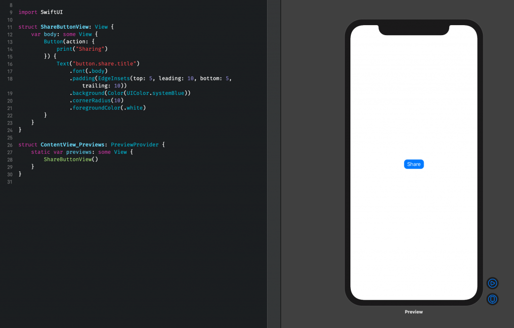
As you can see, we have a blue button with a title that is translated to English by default. It’s displayed in an iPhone display by default which does not really fit our needs as it has a lot of unneeded surrounded whitespace.
Let’s dive in and improve our button previews!
Using a custom size SwiftUI preview
The first thing we can do is using a custom size for our SwiftUI Preview. We have several options for this:
- Using
previewDevice(_:)to select a different device model for the preview - Setting a custom frame size by using
previewLayout(_:)withPreviewLayout.fixed(width:height:) - Making the view size to fit by using
previewLayout(_:)withPreviewLayout.sizeThatFits
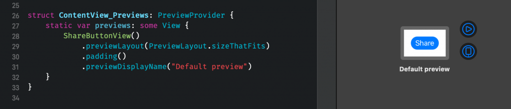
Each option can be valuable for certain circumstances. In our case, we would like to size to fit with a bit of padding. To do that, we will change our preview code as follows:
struct ContentView_Previews: PreviewProvider {
    static var previews: some View {
        ShareButtonView()
            .previewLayout(PreviewLayout.sizeThatFits)
            .padding()
            .previewDisplayName("Default preview")
    }
}
For the sake of readability, we’re also adding a custom display name that appears right underneath the preview. This is already a great improvement and looks as follows:
FREE 5-Day Email Course: The Swift Concurrency Playbook
A FREE 5-day email course revealing the 5 biggest mistakes iOS developers make with with async/await that lead to App Store rejections And migration projects taking months instead of days (even if you've been writing Swift for years)
Showing multiple previews in Xcode
Before we continue to add previews of multiple different states of our SwiftUI button, we need to be able to display multiple previews.
To do this, we embed our preview view in a group view:
struct ContentView_Previews: PreviewProvider {
static var previews: some View {
Group {
ShareButtonView()
.previewLayout(PreviewLayout.sizeThatFits)
.padding()
.previewDisplayName("Default preview 1")
ShareButtonView()
.previewLayout(PreviewLayout.sizeThatFits)
.padding()
.previewDisplayName("Default preview 2")
}
}
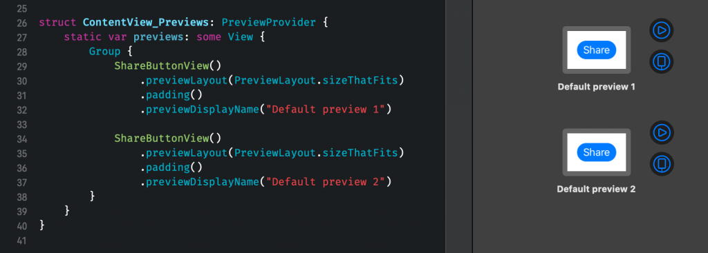
}This will add another preview right underneath our existing preview:
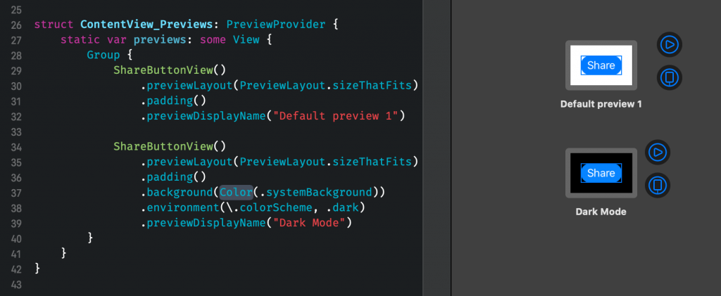
Showing Dark Mode in a SwiftUI Preview
Now that we know how to display multiple previews at once it’s time to add a different state to the stage. The first state we’re adding is a preview that is using a Dark Mode environment so we can easily see both view states side by side.
If you’re new to adding Dark Mode support to your app, you might want to check out my blog post: Dark Mode: Adding support to your app in Swift.
To do this, we need to change the environment of our preview. We will use Environment values for this in which we can choose from a big list of options. In this case, we’re going to use the colorScheme environment value:
struct ContentView_Previews: PreviewProvider {
    static var previews: some View {
        Group {
            ShareButtonView()
                .previewLayout(PreviewLayout.sizeThatFits)
                .padding()
                .previewDisplayName("Default preview 1")

            ShareButtonView()
                .previewLayout(PreviewLayout.sizeThatFits)
                .padding()
                .background(Color(.systemBackground))
                .environment(\.colorScheme, .dark)
                .previewDisplayName("Dark Mode")
        }
    }
}
Note that we’re also updating the background color to use the system background color. This is to make sure that our preview is adopting to dark mode as well by showing a black background color.
This will finally result in the following preview:
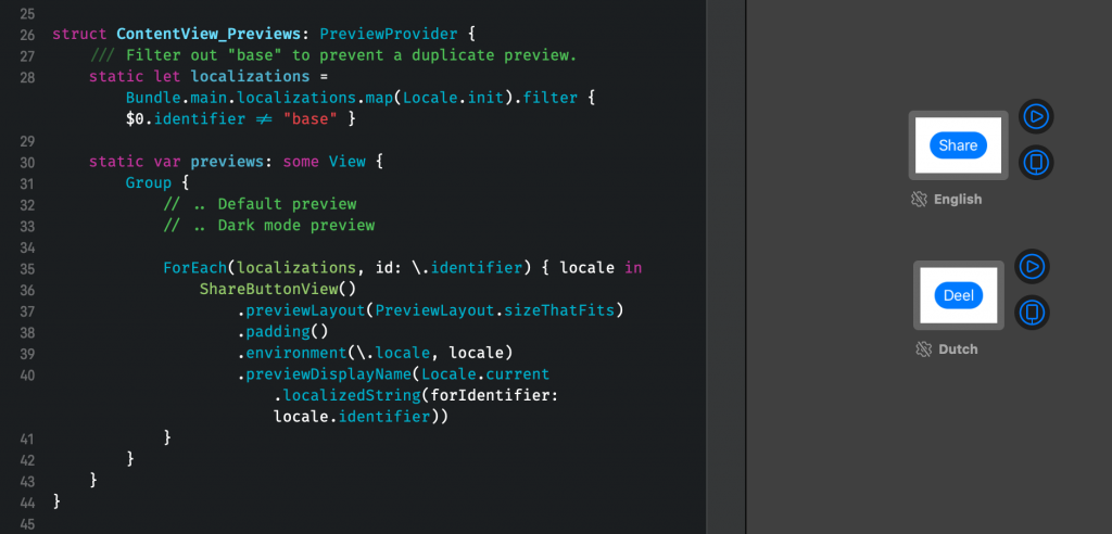
Previewing different locales in Xcode previews
Views are often used in different locales and need to adjust accordingly to display different sizes of copy. Therefore, it’s great to be able to preview a view in a different locale.
We could manually add each locale to our list but it’s more efficient to automate this process. To do this, we will loop over our project’s locale settings and add a preview for each locale. Whenever we add a new locale, a new preview will be added automatically!
struct ContentView_Previews: PreviewProvider {
    /// Filter out "base" to prevent a duplicate preview.
    static let localizations = Bundle.main.localizations.map(Locale.init).filter { $0.identifier != "base" }

    static var previews: some View {
        Group {
            // .. Default preview
            // .. Dark mode preview

            ForEach(localizations, id: \.identifier) { locale in
                ShareButtonView()
                    .previewLayout(PreviewLayout.sizeThatFits)
                    .padding()
                    .environment(\.locale, locale)
                    .previewDisplayName(Locale.current.localizedString(forIdentifier: locale.identifier))
            }
        }
    }
}
Note that we’re filtering out the base localization as this would be the same as our English translation. We’re looping over each locale and update our preview by setting the locale environment. We’re also updating our preview display name to show the language used. This results in a preview for English and Dutch in our example:
Creating a preview for each Dynamic Type Size
Our last state to add a preview for is to validate the different dynamic type sizes. There are quite a few sizes to support so you might not want to automate this process. Instead, it’s better to pick a few sizes that differ enough in size to validate whether a bigger size looks good.
In our example, we’re going to display a preview for the categories extra small, large, and extra extra extra large. We do this by iterating over an array of these size categories, updating the sizeCategory environment value, and updating the preview display name:
struct ContentView_Previews: PreviewProvider {

    static let dynamicTypeSizes: [ContentSizeCategory] = [.extraSmall, .large, .extraExtraExtraLarge]

    static var previews: some View {
        Group {
            // .. Default preview
            // .. Dark mode preview
            // .. Localizations preview

            ForEach(dynamicTypeSizes, id: \.self) { sizeCategory in
                ShareButtonView()
                    .previewLayout(PreviewLayout.sizeThatFits)
                    .padding()
                    .environment(\.sizeCategory, sizeCategory)
                    .previewDisplayName("\(sizeCategory)")
            }

        }
    }
}
This creates three different states of our button and shows us directly how our button title is adapting the different text settings:
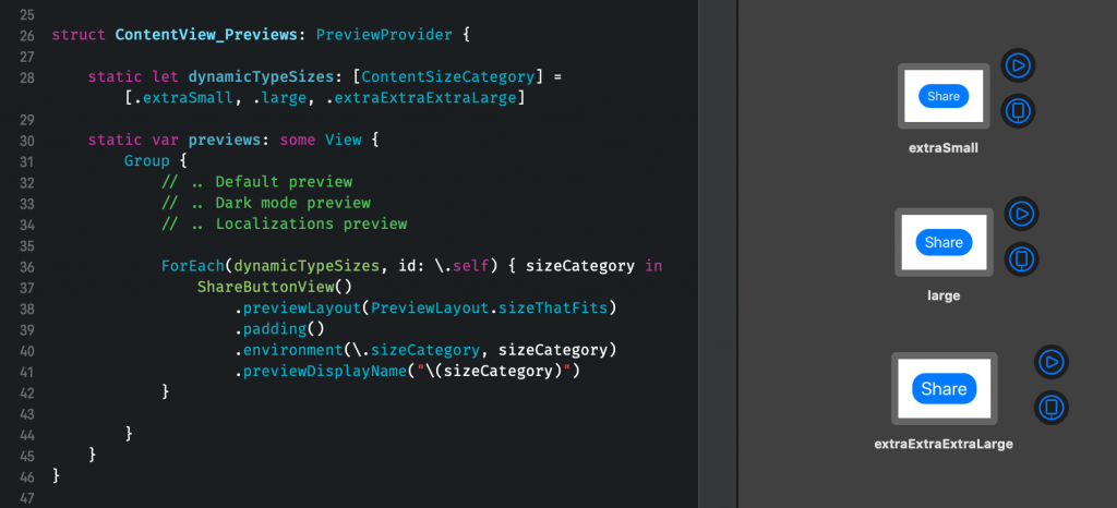
This is great! We can now see each dynamic type size side by side and develop our button while making sure our title label adjusts accordingly.
Creating a generic preview for UI elements
When developing an app you’re likely to create lots of different views at once. It’s a waste of time to add those different states of SwiftUI previews to each of your elements.
To solve this we can create a generic solution that takes your view and shows a preview for each of the states we want to check. The code for this looks as follows:
struct UIElementPreview<Value: View>: View {

    private let dynamicTypeSizes: [ContentSizeCategory] = [.extraSmall, .large, .extraExtraExtraLarge]

    /// Filter out "base" to prevent a duplicate preview.
    private let localizations = Bundle.main.localizations.map(Locale.init).filter { $0.identifier != "base" }

    private let viewToPreview: Value

    init(_ viewToPreview: Value) {
        self.viewToPreview = viewToPreview
    }

    var body: some View {
        Group {
            self.viewToPreview
                .previewLayout(PreviewLayout.sizeThatFits)
                .padding()
                .previewDisplayName("Default preview 1")

            self.viewToPreview
                .previewLayout(PreviewLayout.sizeThatFits)
                .padding()
                .background(Color(.systemBackground))
                .environment(\.colorScheme, .dark)
                .previewDisplayName("Dark Mode")

            ForEach(localizations, id: \.identifier) { locale in
                self.viewToPreview
                    .previewLayout(PreviewLayout.sizeThatFits)
                    .padding()
                    .environment(\.locale, locale)
                    .previewDisplayName(Locale.current.localizedString(forIdentifier: locale.identifier))
            }

            ForEach(dynamicTypeSizes, id: \.self) { sizeCategory in
                self.viewToPreview
                    .previewLayout(PreviewLayout.sizeThatFits)
                    .padding()
                    .environment(\.sizeCategory, sizeCategory)
                    .previewDisplayName("\(sizeCategory)")
            }

        }
    }
}
This class contains all the steps we took in this blog post:
- Showing a default sized preview
- A preview with Dark Mode enabled
- Each localization of our project applied to a preview
- The three different dynamic type sizes applied to our element
The code for our ShareButtonView preview can then be simplified to the following lines of code:
struct ContentView_Previews: PreviewProvider {

    static var previews: some View {
        UIElementPreview(ShareButtonView())
    }
}
That’s a lot less than copying over all our preview settings from view to view!
Conclusion
SwiftUI Previews help us to develop custom views a lot faster. We can set up our environment to display each state side by side and quickly catch UI issues. Localization, dark mode, and dynamic type sizes influence the way our view is displayed and can add up to the time needed to create views. With the right previews set up, we allow ourselves to speed up this process and apply each environment quickly with our custom preview view.
If you like to improve your SwiftUI knowledge, even more, check out the SwiftUI category page. Feel free to contact me or tweet to me on Twitter if you have any additional tips or feedback.
Thanks!