The @ScaledMetric property wrapper in SwiftUI allows you to adopt custom values to dynamic type settings. Your custom values will scale proportionally whenever the user changes the dynamic type setting.
While elements like text scale are automatically based on the Dynamic Type setting, other values like padding or image sizes might not. Connecting these to the same scalable setting will make your UI look more balanced in different size classes.

What is the Dynamic Type feature?
The Dynamic Type feature allows users to adjust the size of textual content on both the app and system levels. It’s part of the accessibility features family and accommodates users requiring larger text for readability. It also offers smaller text sizes for those users that can handle it, allowing for more content to be visible on screen.
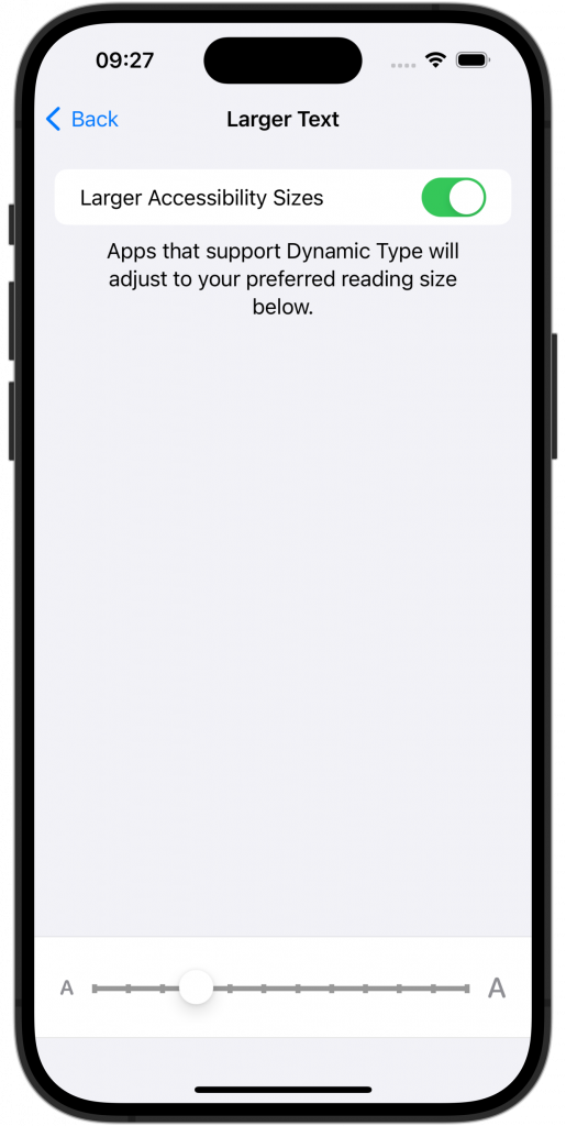
You can find the setting by going into the Settings app → Accessibility → Display & Text Size → Larger Text:
The iOS and iPadOS systems come with the following sizes:
- xSmall, Small, Medium, Large (Default), xLarge, xxLarge, xxxLarge
While watchOS supports:
- xSmall, Small, Large, xLarge, xxLarge, xxxLarge
I recommend reading Apple’s official documentation for more details on typography sizes.
While default components like SwiftUI’s Text will adjust automatically, you might need to use the @ScaledMetric Property Wrapper for numeric values like padding or image sizes.

FREE 5-Day Email Course: The Swift Concurrency Playbook
A FREE 5-day email course revealing the 5 biggest mistakes iOS developers make with with async/await that lead to App Store rejections And migration projects taking months instead of days (even if you've been writing Swift for years)
How do I add support for Dynamic Type in my app?
Your app will automatically support Dynamic Type if you use SwiftUI Text elements and default fonts. However, in all cases, it’s essential to verify your app’s behavior by testing your views using different Dynamic Type sizes. Even though standard components scale automatically, you might end up with views that could look better. The @ScaledMetric Property Wrapper can help you fix this, but you must first know how to validate your app.
There are different ways of testing your app for Dynamic Type. You can use the System Settings app above to change the size, but it’s time-consuming to open it whenever you want to change the scale. I prefer using RocketSim’s accessibility settings to adjust the size while I have my app open. In the following example, I’ve adjusted the size to Accessibility Extra Extra Extra Large (xxxLarge):
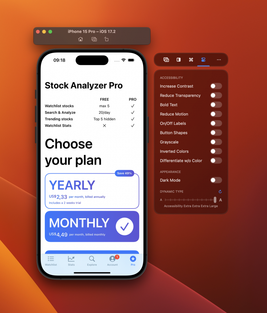
The above image shows that the “Choose your plan” section scaled up nicely. However, the features table at the top does not respond to the accessibility XXXL Dynamic Type setting. The following code demonstrates a piece of code behind the features tables:
var features: some View {
    let freeFeatureWidth: CGFloat = 150
    let proFeatureWidth: CGFloat = 50
    return VStack(spacing: 8) {
        let freeCategoryName = "FREE"
        let proCategoryName = "PRO"
        HStack {
            Text("")
                .frame(maxWidth: .infinity)
            Text(freeCategoryName)
                .bold()
                .frame(width: freeFeatureWidth)
            Text(proCategoryName)
                .bold()
                .frame(width: proFeatureWidth)
        }.accessibility(hidden: true)
In my case, I’ve been using default Text components but also a fixed width for each column. It would be better to rewrite this code using SwiftUI’s Grid component without relying on fixed-width settings.
Using the @ScaledMetric Property Wrapper
The @ScaledMetric Property Wrapper allows you to scale a numeric value proportionally with the Dynamic Type setting. This can be valuable when you want to adjust values like padding or image size based on the text size.
Imagine the following piece of code:
import SwiftUI

struct ContentView: View {

    let rocketSimLogoWidth = 100.0

    var body: some View {
        VStack {
            Image("RocketSim_svg_logo")
                .resizable()
                .aspectRatio(contentMode: .fit)
                .frame(width: rocketSimLogoWidth)
                .foregroundStyle(.black)
            Text("Hello, Developer!")
        }
        .padding()
    }
}

#Preview {
    ContentView()
}
By default, this code would result in the following adjustments for different text sizes:
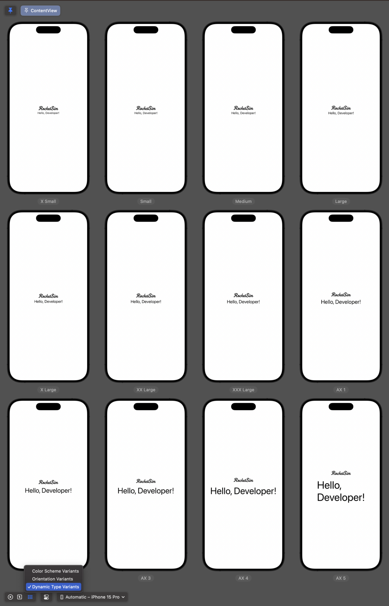
While the text scales well, you can see that the image doesn’t scale proportionally. We can solve this by using the @ScaledMetric Property Wrapper:
@ScaledMetric var rocketSimLogoWidth = 100.0We only have to add the Property Wrapper and change the let to a var. Once done, you can see that the logo scales proportionally based on the Dynamic Type size:
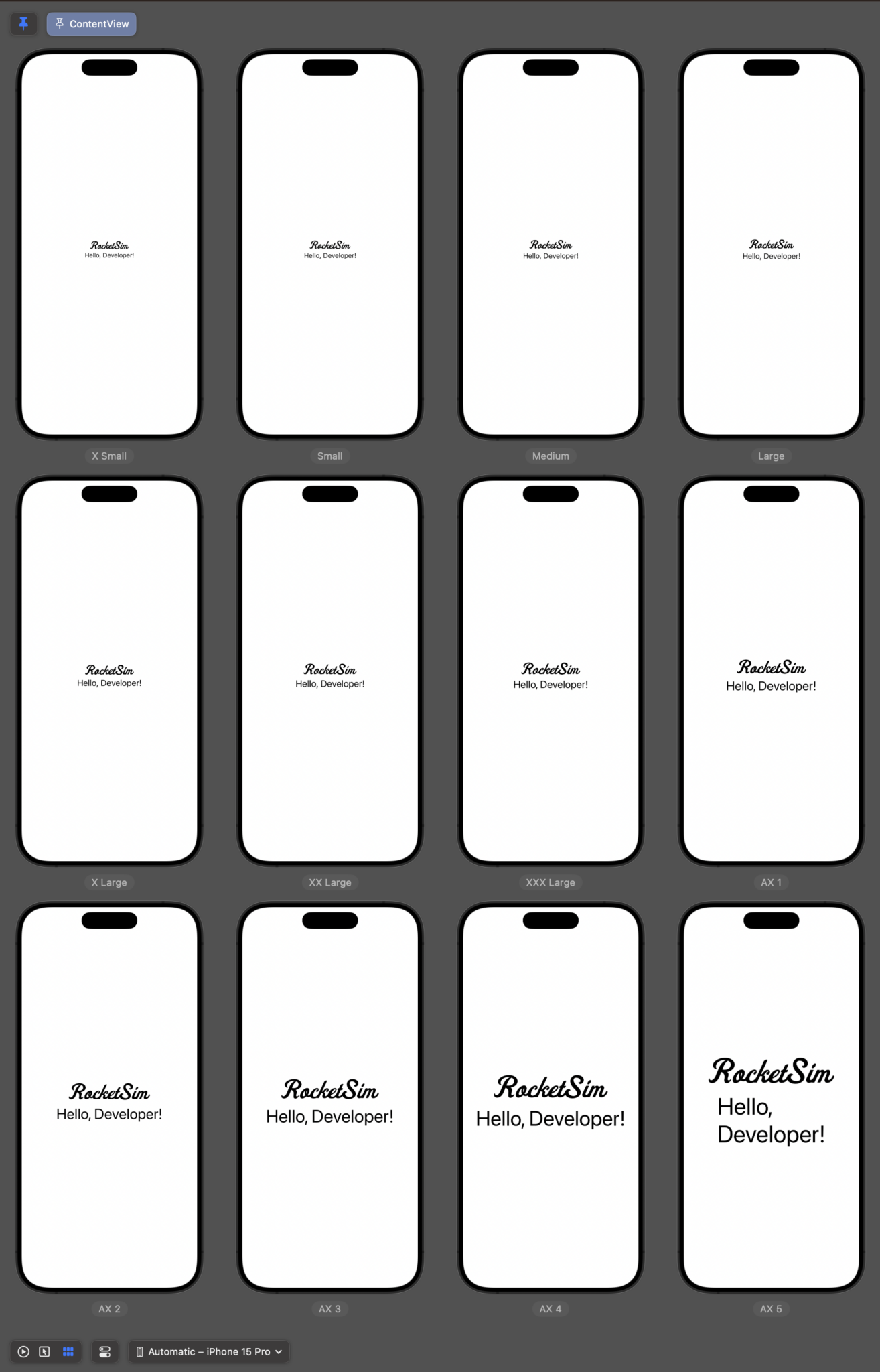
This looks much better and ensures a logo that scales based on the user’s preference.
Using RocketSim to test for Dynamic Type support
As demonstrated shortly, RocketSim allows you to test your app quickly for dynamic type support. You can see this feature in action on YouTube:
Apart from Dynamic Type, RocketSim also allows you to test other accessibility features like dark mode, increased contrast mode, and button shapes.
Conclusion
Dynamic Type is an important system feature that your app needs to support. It’s an accessibility feature that makes your app more usable for users who prefer smaller or larger text sizes. While system components support this feature well, you do need to check your app for conformance. Sometimes, the @ScaledMetric Property Wrapper can help adjust your app accordingly.
If you want to improve your SwiftUI knowledge, even more, check out the SwiftUI category page. Feel free to contact me or tweet me on Twitter if you have any additional tips or feedback.
Thanks!