View Composition allows you to create reusable components to create enriched views. You can extract logic into reusable components using the ViewModifier protocol in SwiftUI and set up your code for reusability.
I’ve been developing a set of view modifiers in RocketSim to enable TextField customizations. Combining all modifiers results in the most advanced TextField, but sometimes I need one of the modifiers. Using view modifiers instead of actual custom views will give you a much more flexible set of UI elements since you can endlessly combine each modifier with others. Let’s dive in!

View Composition Explained
View composition is best explained as combining multiple views to create a new, more enriched view. Here’s an example of a TextField that I created in RocketSim:
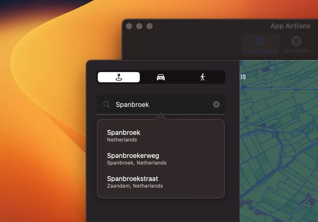
The textfield looks like a regular search textfield, as you might recognize from other native Mac apps. However, we could decompose the textfield into reusable view components:
- A leading icon, in this case, a magnifying glass
- Text can be cleaned using the trailing clear button
- The background is customized to account for the leading icon & tap area
- Clicks can be handled to show the popover, even though the textfield might be active
You’ll likely start by making a custom SwiftUI view when creating such a view. In my case, I was able to compose several view modifiers, resulting in the following code:
TextField("", text: $locationSearcher.queryFragment, prompt: Text(placeholderText))
    /// Add the leading magnifying glass icon.
    .iconTextField(iconSystemName: iconSystemName, iconScale: iconScale)
    /// Focus the textfield on tap, handle the tap to show search results.
    .textFieldFocusOnTap(onTapHandler: {
        guard !locationSearcher.queryFragment.isEmpty, !shouldShowSearchResults else {
            return
        }
        shouldShowSearchResults = true
    })
    /// Add a clear button + use the handler to clear the map pin.
    .clearButton(text: $locationSearcher.queryFragment, onClearHandler: {
        selectedLocation = nil
    })
This is where view modifiers shine, preventing me from having to pass all kinds of bindings down to a custom view and, from there, down to the inner text field. Instead, I can talk directly to the text field and handle all modifications.

FREE 5-Day Email Course: The Swift Concurrency Playbook
A FREE 5-day email course revealing the 5 biggest mistakes iOS developers make with with async/await that lead to App Store rejections And migration projects taking months instead of days (even if you've been writing Swift for years)
Creating a composable view element using a view modifier
View composition starts by creating composable elements using new view modifiers. I wrote other articles covering this same technique, like creating a redacted view modifier or a conditional view modifier. In this example, we’re going to create the clear button modifier:
private struct ClearTextButtonViewModifier: ViewModifier {
    /// A binding towards the text that we'll monitor
    /// to determine whether or not we show the clear button.
    @Binding var text: String

    /// An optional clear handler to perform additional actions
    /// when the text is cleared.
    let onClearHandler: (() -> Void)?

    public func body(content: Content) -> some View {
        ZStack {
            /// References your input `Content`.
            /// Most likely the `TextField`.
            content

            /// The `ZStack` allows us to place this button
            /// on top of the input `Content`.
            HStack {
                Spacer()
                Button {
                    /// Clear out the text using the @Binding property.
                    text.removeAll()
                    /// Call the optional clear handler to allow
                    /// for further customization.
                    onClearHandler?()
                } label: {
                    Image(systemName: "xmark.circle.fill")
                        .foregroundColor(Color(.placeholderTextColor))
                        .padding(.trailing, 10)
                }.buttonStyle(.plain)
            }
            /// Only show the button if there's actually text input.
            .opacity(text.isEmpty ? 0.0 : 1.0)
        }
    }
}
I’ve explained the code using inline documentation, but you can see that we’re using the ViewModifier protocol. View modifiers are best explained as modifiers that you apply to a view or another view modifier, producing a different version of the original input value. In other words: view modifiers modify an input view.
Accessing the view modifier through a view extension
You might have noticed the private keyword before the struct definition in the above code example. I purposely added this since I want the view modifier to be accessible through a similar technique as static member lookup in generic contexts. If you’re new to this technique, I encourage you to read my article Improve discoverability using Static Member Lookup in Generic Contexts.
Without a view extension, you would have to configure the view modifier as follows:
TextField("", text: $text)
    .modifier(ClearTextButtonViewModifier(text: $text, onClearHandler: {
        print("Text was cleared!")
    }))
The downside is that we must keep the view modifier and its init publicly accessible. Doing so might be acceptable, but if you’re creating a package of view components, you want to expose as little as possible since all exposable code needs to be maintained. Secondly, the modifier will not be findable via autocompletion, reducing the discoverability of the available components.
Instead, we can keep the view modifier privately scoped and allow view composition through the following view extension:
extension View {

    /// Adds a clear button on top of the input view. The button clears the given input
    /// text binding.
    /// - Parameters:
    ///   - text: The text binding to clear when the button is tapped.
    ///   - onClearHandler: An optional clear handler that will be called on clearance.
    func clearButton(text: Binding<String>, onClearHandler: (() -> Void)?) -> some View {
        modifier(ClearTextButtonViewModifier(text: text, onClearHandler: onClearHandler))
    }
}
With this extension in place, we can leverage autocompletion and add the modifier accordingly:
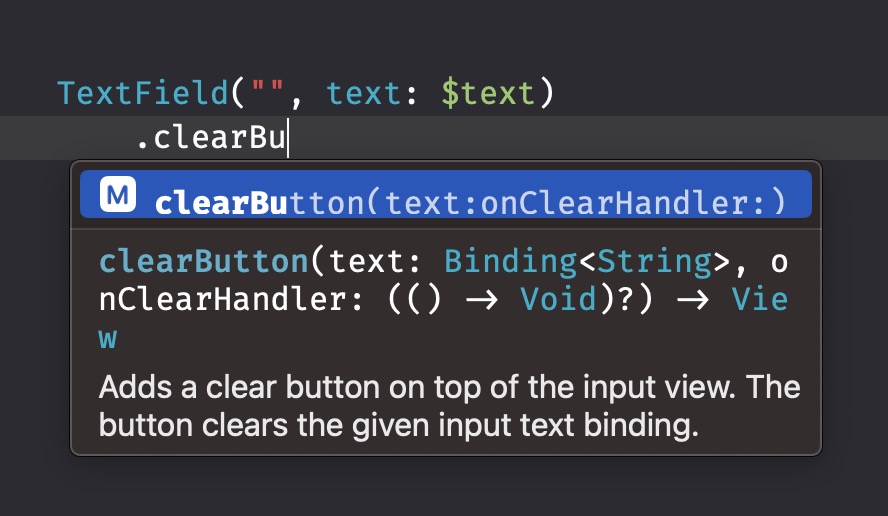
You and your colleagues will be able to discover your view components, and you can now add a clear button to any view.
Conclusion
Creating view components early allows you to reuse code in the future, speeding up your development process. Components become discoverable using view extensions, seamlessly enabling you to keep the implementation details private. You can build a Swift package of view modifiers to reuse components across multiple apps.
If you want to improve your SwiftUI knowledge, even more, check out the SwiftUI category page. Feel free to contact me or tweet me on Twitter if you have any additional tips or feedback.
Thanks!