Apple introduced Swift Charts during WWDC ’22, allowing you to visualize data into bar charts. Before this framework, we had to include all kinds of third-party solutions to draw charts in SwiftUI. Visualizing data using a similar declarative syntax to SwiftUI is simply fantastic.
A bar chart is just one of the available options to visualize your data. In general, many of the methods you’ll learn about today apply to other charts, too. In fact, you could potentially replace a single element to change from a bar to a line chart. Let’s dive in!

Setting up your Chart data
Before we start creating a chart, it’s important to have data to work with. For this article, I’ll use the build activity data I use for RocketSim’s Xcode Build Statistics:
/// Describes an Xcode build activity on a certain data, for a given duration.
struct BuildActivity: Identifiable, Codable {
    var id: TimeInterval { date.timeIntervalSince1970 }
    let date: Date
    let scheme: String
    let numberOfBuilds: Int
}
When starting a new chart, I recommend setting up sample data to work with. You can use this data in both your running app and SwiftUI previews:
extension BuildActivity {
    static func sampleData() -> [BuildActivity] {
        [
            sampleData(for: "RocketSim"),
            sampleData(for: "Stock Analyzer")
        ].flatMap { $0 }
    }

    private static func sampleData(for scheme: String) -> [BuildActivity] {
        (0...365).map { index -> BuildActivity in
            /// Create a random number of builds. Some days will not have any builds
            let numberOfBuilds = Int.random(in: 0...100)

            /// Using the index, we're creating a full year of data
            let date = Calendar.current.date(byAdding: .day, value: -index, to: .now)!

            return BuildActivity(
                date: date,
                scheme: scheme,
                numberOfBuilds: numberOfBuilds
            )
        }
    }
}
These static methods allow you to create a collection of build activities for two different schemes. This data set works great for visualizing a bar chart in this article.

FREE 5-Day Email Course: The Swift Concurrency Playbook
A FREE 5-day email course revealing the 5 biggest mistakes iOS developers make with with async/await that lead to App Store rejections And migration projects taking months instead of days (even if you've been writing Swift for years)
Creating a basic Bar Chart
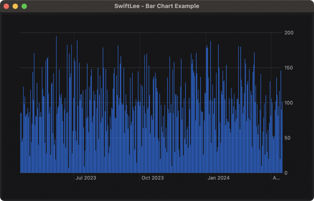
We can use our sample data to create a basic Bar Chart using Swift Charts in SwiftUI:
The code for this chart looks as follows:
import SwiftUI
import Charts

struct BarChart: View {

    let buildActivities: [BuildActivity]

    var body: some View {
        Chart(buildActivities) { buildActivity in
            BarMark(
                x: .value("Date", buildActivity.date, unit: .day),
                y: .value("Total Count", buildActivity.numberOfBuilds)
            )
        }
    }
}
After importing the Charts framework, we can use the Chart element by passing in our build activities data. The closure requires us to return a data element, for which we will return a bar mark. You can see this as a single bar inside our bar chart.
The x and y values determine how your data will be visualized. We set the date unit to .day since we want to show data for every single day. You could change this value to control the time period of data.
Controlling the chart range of data
While the basic bar chart looks great already, it’s not really useful with a full year of data. You might want to zoom into a single week of data. There are two ways of doing this, each with different results.
The first approach is to use the chartXScale modifier:
/// Chart X scale zoom in, but data is visible out of bounds
.chartXScale(
    domain: startDate...Date.now,
    range: .plotDimension(startPadding: 10, endPadding: 10)
)
By configuring a start date of one week back, we will get the following chart as a result:
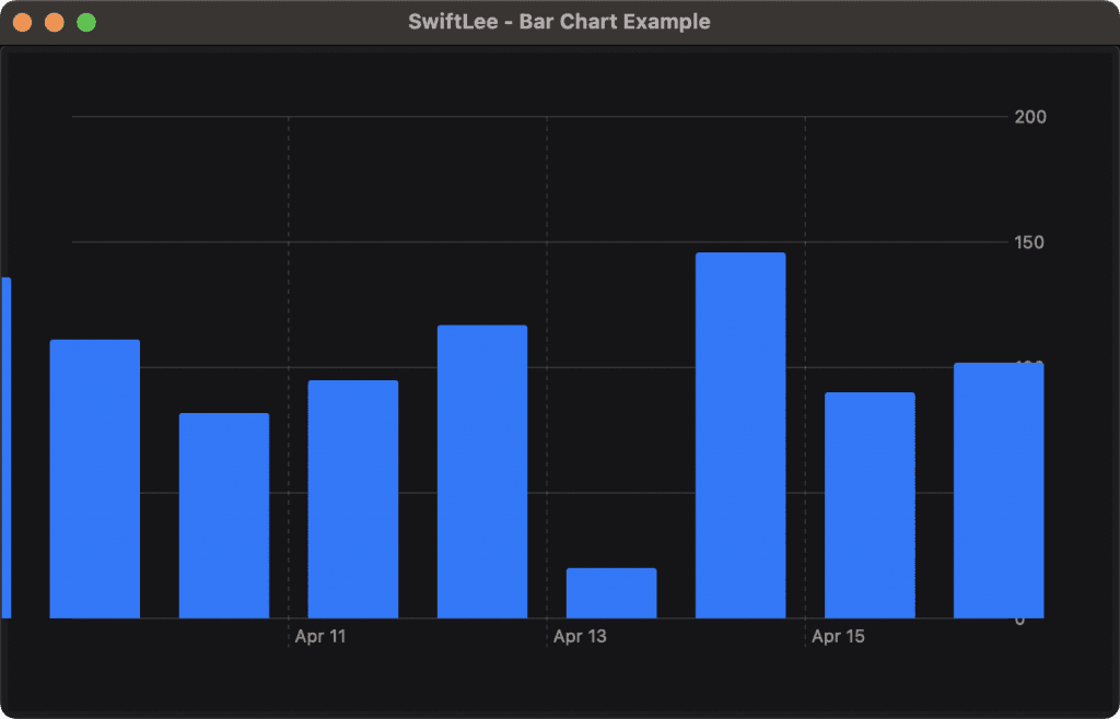
While we can clearly see data for just the last 7 days, it’s not a satisfying result. The bars go out of bounds and our y-scale labels become covered. You could still use this approach as a zoom functionality combined with the chartScrollableAxes modifier, but it’s better to only configure your chart with the data you want to display.
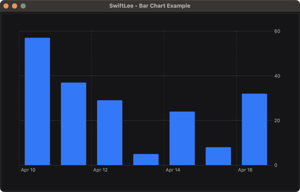
In other words, we will split our data only to contain data for seven days:
BarChart(buildActivities: Array(BuildActivity.sampleData().prefix(7)))Since our sample data is in reverse order, we can use the prefix modifier to get the first 7 elements. The resulting chart looks much better:
How to change the color of a Bar Chart?
The default bar chart color will match the accent color of your app. You can change the color using the foreground style modifier:
Chart(buildActivities) { buildActivity in
    BarMark(
        x: .value("Date", buildActivity.date, unit: .day),
        y: .value("Total Count", buildActivity.numberOfBuilds)
    )
    /// Change the color of bars to orange
    .foregroundStyle(Color.orange)
}
How to split up a bar chart into groups?
Bar charts allow you to split data into groups and visualize them individually. For example, we can split our bar chart based on the given scheme:
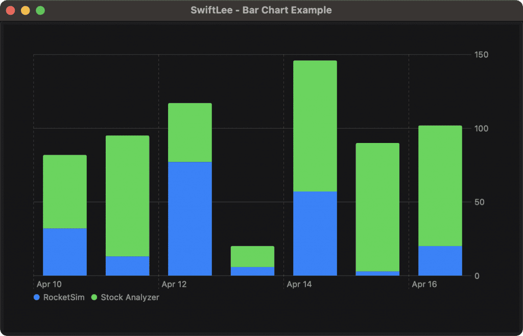
You need to provide a specific value that will be used to split up the data. Using a certain category that doesn’t result in too many different groups is recommended. The code for our example looks as follows:
Chart(buildActivities) { buildActivity in
    BarMark(
        x: .value("Date", buildActivity.date, unit: .day),
        y: .value("Total Count", buildActivity.numberOfBuilds)
    )
        /// Show a different color for each scheme
        .foregroundStyle(
            by: .value("Scheme", buildActivity.scheme)
        )
}
Swift Charts will assign a default color to each group. You can override this color by specifying a specific color for each group identifier. In our case, we provide a color for each given scheme:
Chart(buildActivities) { buildActivity in
BarMark(
x: .value("Date", buildActivity.date, unit: .day),
y: .value("Total Count", buildActivity.numberOfBuilds)
)
/// Show a different color for each scheme
.foregroundStyle(
by: .value("Scheme", buildActivity.scheme)
)
}
/// Customize the colors for each scheme
.chartForegroundStyleScale([
"RocketSim" : .blue,
"Stock Analyzer": .red
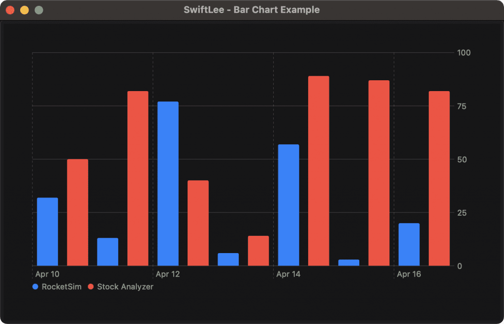
])Finally, you might want to show the groups side by side. You can do this using the position modifier:
Chart(buildActivities) { buildActivity in
    BarMark(
        x: .value("Date", buildActivity.date, unit: .day),
        y: .value("Total Count", buildActivity.numberOfBuilds)
    )
        /// Show a different color for each scheme
        .foregroundStyle(
            by: .value("Scheme", buildActivity.scheme)
        )
        /// Show bars side by side
        .position(
            by: .value("Scheme", buildActivity.scheme),
            axis: .horizontal,
            span: .ratio(1)
        )
}
    /// Customize the colors for each scheme
    .chartForegroundStyleScale([
        "RocketSim" : .blue,
        "Stock Analyzer": .red
    ])
The axis value controls whether the bars are shown on top of each other (vertical) or next to each other (horizontal). The span allows you to control the width of each individual bar. The resulting bar chart looks as follows:
Conclusion
Swift Charts make it joyful to visualize data into bar charts. While we’ve only covered the basics in this article, you can already see a fulfilling result. You can customize the color of a bar, group values by a specific category, and control the range of data displayed.
If you want to improve your Swift Charts knowledge even more, check out the SwiftUI category page. Feel free to contact me or tweet me on Twitter if you have any additional tips or feedback.
Thanks!